Data Governance Database
This webpage examines ten international data governance frameworks that are shaping the global data governance debate, allowing users to compare the frameworks' principles with an optimized data table layout and robust filtering system.
About
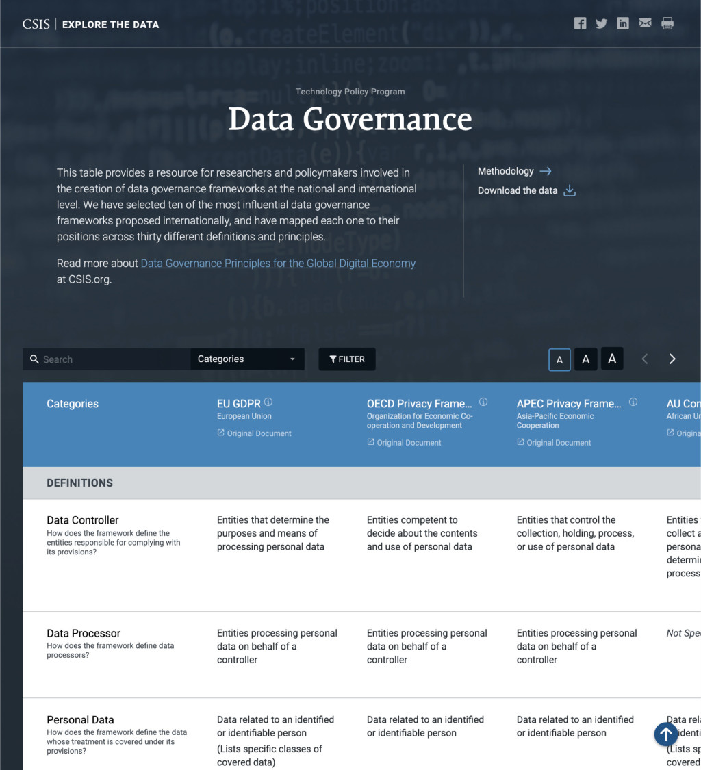
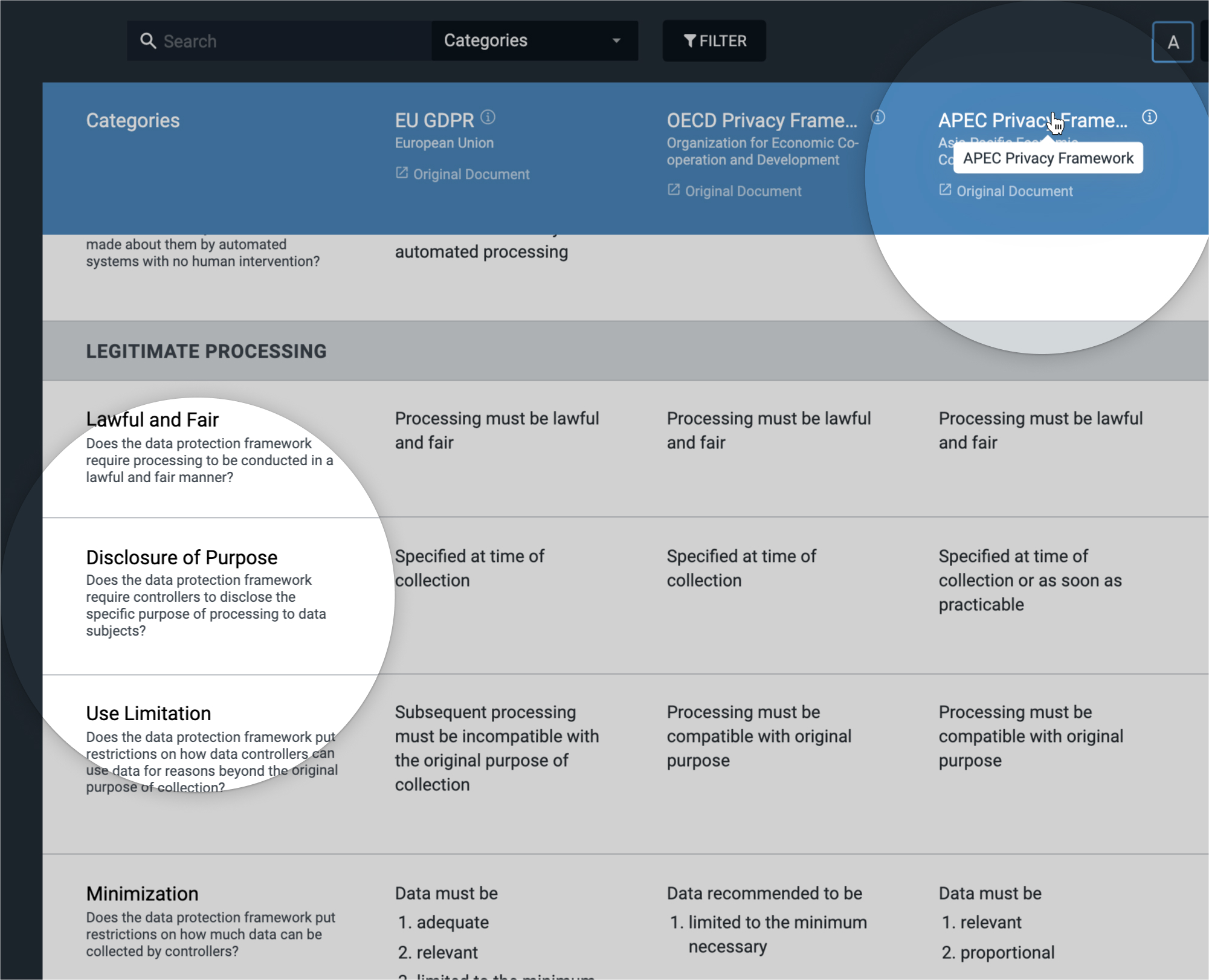
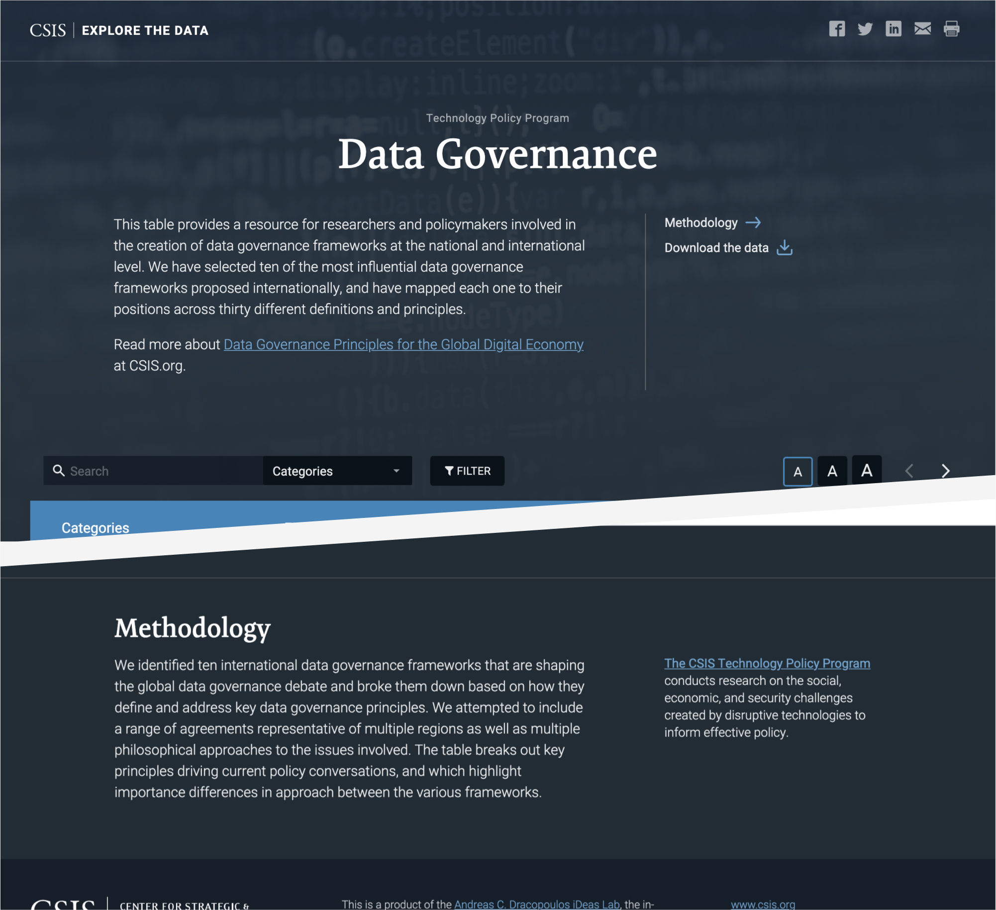
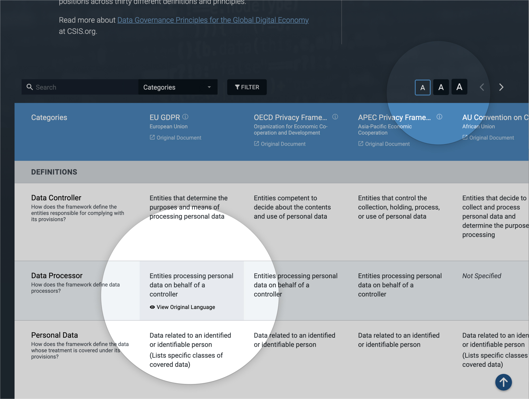
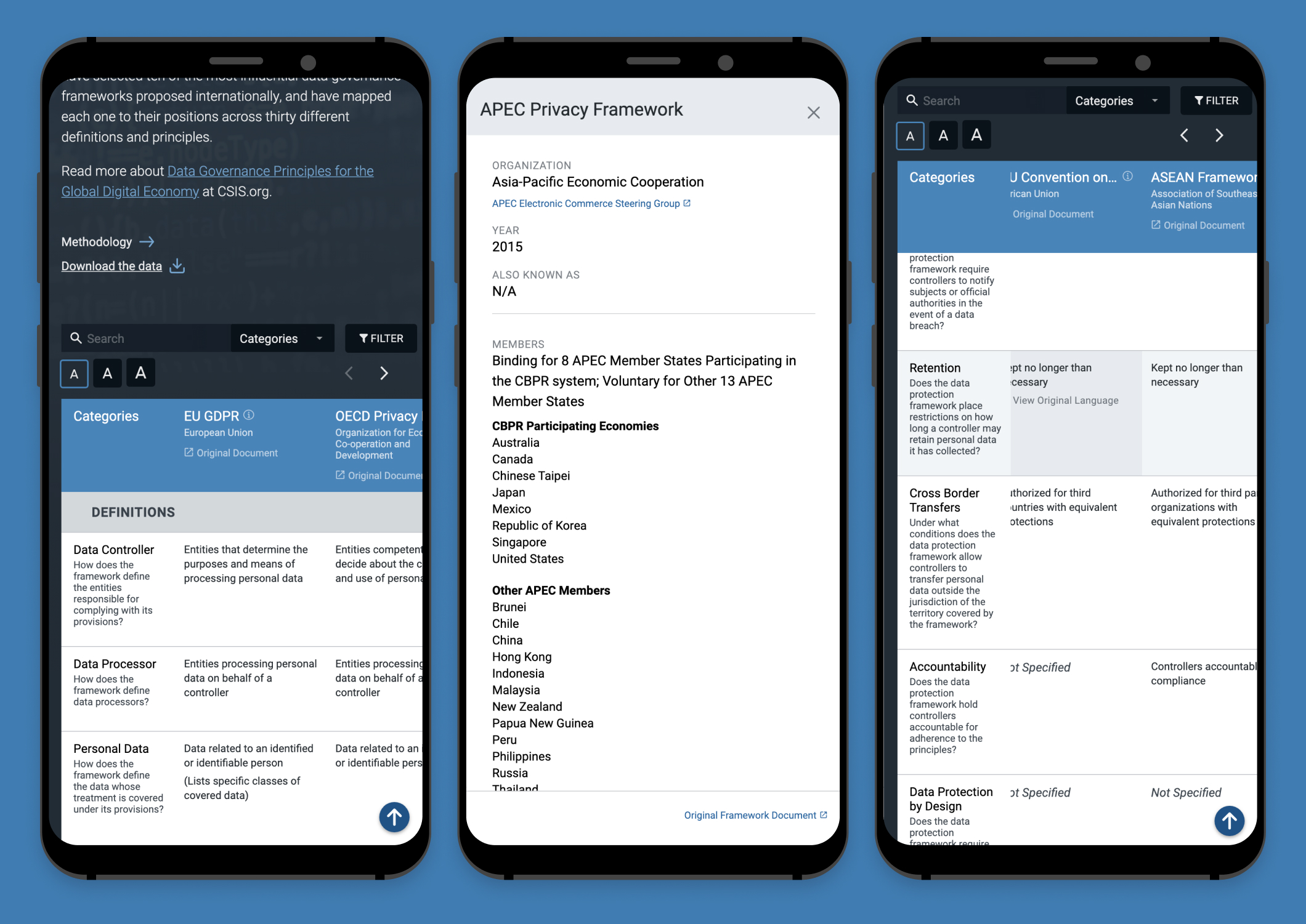
The Data Governance Database is a single webpage created in partnership with the Technology Policy Program at CSIS. It compares ten international data governance frameworks that are shaping the global data governance debate, providing a resource for researchers and policymakers involved in the creation of such frameworks at a national and international level.
The Tech Policy team broke these frameworks down based on how they define and address key data governance principles. As stated in their Methodology:
“We attempted to include a range of agreements representative of multiple regions as well as multiple philosophical approaches to the issues involved. The table breaks out key principles driving current policy conversations, and which highlight important differences in the approach between the various frameworks.”
It started as several scary, scary spreadsheets, but we hoped to give this resource a filterable, approachable form.
There isn't a lack of complex tables at a Think Tank, so the developer and I tried to approach this project as the first instance of a new type of product for our program partners.
Data's tangled web
The first step for me was to chat with the Program about their objectives and the audience they wanted to reach. I took a first look at the spreadsheets and... wow. I walked through the layers of information with one of the research team members, trying to wrap my head around the categories and hierarchies.
Eventually, I established a few different questions that would help me organize the data and develop the interface:
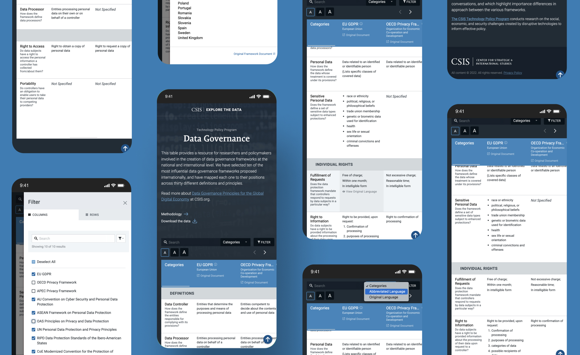
Default view. What data would be visible when the page loaded?
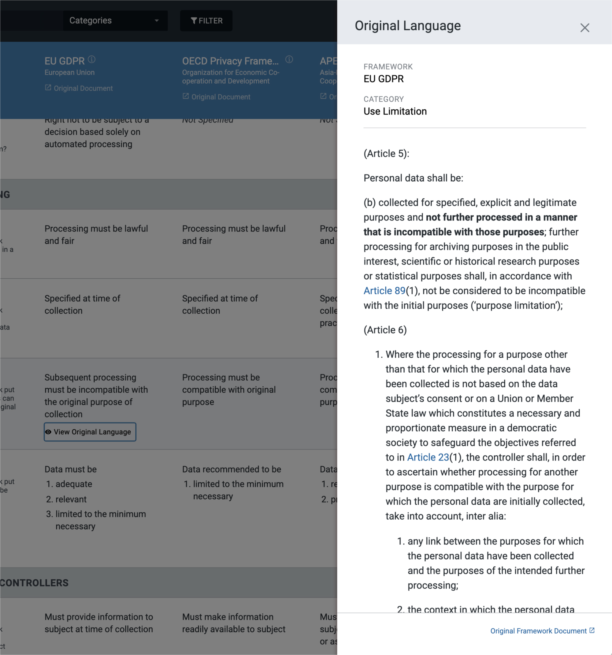
Advanced view. What information could be hidden until the user chooses to see it?
Filters. What filters would the audience most likely want to apply?
Variance. What was the average character or word count for the data, and what extremes would I need to accommodate?
Definition. What data would require explanation (i.e. abbreviations or jargon)?
When considering how we would add allllllll that data to the table, we kept future projects in mind. In order to make input less of a hassle for our team and mitigate the risk of errors during transfer, we decided to pull in the data from JSON files, which could be exported directly from the clients’ spreadsheets.
Product branding
We were hoping this product could be reused, so I attempted to make design decisions with that in mind.
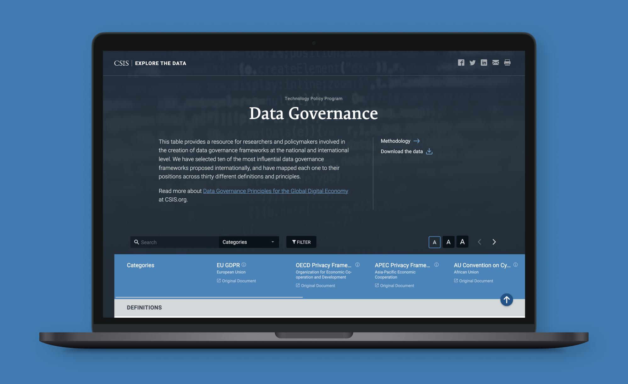
The overall color and typography were reflective of CSIS branding. However, there were some opportunities for versatility, so the Tech Policy staff could tailor the page to suit their content and the program's branding.
Unlike a lot of other think tanks, programs' funding at CSIS is decentralized. They have to be entrepreneurial, fundraising to "rent" space and equipment for their staff, and purchase iLab services. When designing products that could be used across the center, I tried to offer a certain amount of flexibility, giving the client space to promote their program while maintaining some consistency with the overarching CSIS brand.
Making complexity approachable and accessible
I have never done so much research on data table design and accessibility, and it was honestly a blast (which is "weird, but I'm not surprised you think that", my developer partner claimed).
I've learned through the years that usability and accessibility walk hand in hand, and I knew I had to make an extra effort to turn that huge mountain of data into a practical resource for the Tech Policy Program's audience.
Originally, the table body content did not have the proper semantic HTML in the cells, so things like list elements were not coded or formatted in an accessible way. We worked with the researchers to add the appropriate tags to their spreadsheet content.
Reflections
Our clients were definitely pleased with the outcome, and I truly enjoyed working on this mighty table. I had the opportunity to dive into research on UI elements that I didn't use often, from table accessibility to indeterminate checkbox functionality.
As I am apt to do, I worked closely with the developer throughout much of the process, even after providing handoff documentation. If she ran into an issue, I would just scoot on over to her desk and we would discuss the problem.
Sometimes the issue was one that didn't have much effect on usability, so I just let her do whatever was easiest for her (it's all about compromise). Other times we'd brainstorm another way to achieve a similar outcome. I would search the internet to find examples of functionalities or layouts at work, and she could poke around in the code.
I love this kind of problem-solving, and I always end up adding to my front-end dev knowledge along the way.