Health Security Commission
The CSIS Commission on Strengthening America’s Health Security aims to chart a bold vision for the future of U.S. leadership in global health security, at home and abroad.
About
The Commission on Strengthening America’s Health Security was led by CSIS's Global Health Policy Center and comprised of a distinguished and diverse group of leaders from the fields of health and security. Over a two-year period, the Commission planned to focus on five pre-determined issues or pillars related to health security in addition to the overarching issue of health security. Along with an advisory group of subject experts, the Commission would periodically release series of papers and reports in order to chart a new vision for the future of U.S. leadership in global health security.
This website was created to be the Commission’s online presence. It would be a resource for the commissioners during the two-year period and act as an ongoing platform to house the project’s research, strategies, and recommendations.
The Global Health Policy Center, often in partnership with other research groups at CSIS, continues to publish content roughly once a month. They produce a variety of commentary and analysis pieces, as well as videos, podcasts, links to external commentaries, and information regarding events.
IA hurdles
When we first began working with the Global Health Policy Center, they had a loose idea of what they wanted to do with the site. I guided them through iterations of the site map to piece together a high-level view of the information architecture.
The research experts at CSIS are very capable of wrapping their heads around what content they want to produce, but I've learned that I shouldn't assume they have a solid grasp or opinion of how that content should be organized on the web. These clients have ample experience writing for publications, but that linear line of thinking isn't how their users will navigate the website.
I found that making this diagram was an invaluable tool as we discussed the hierarchy of pages, the connections between them, and how target audiences would navigate the site content. This deliverable also opened the door to conversations about organization schemes and nomenclature.
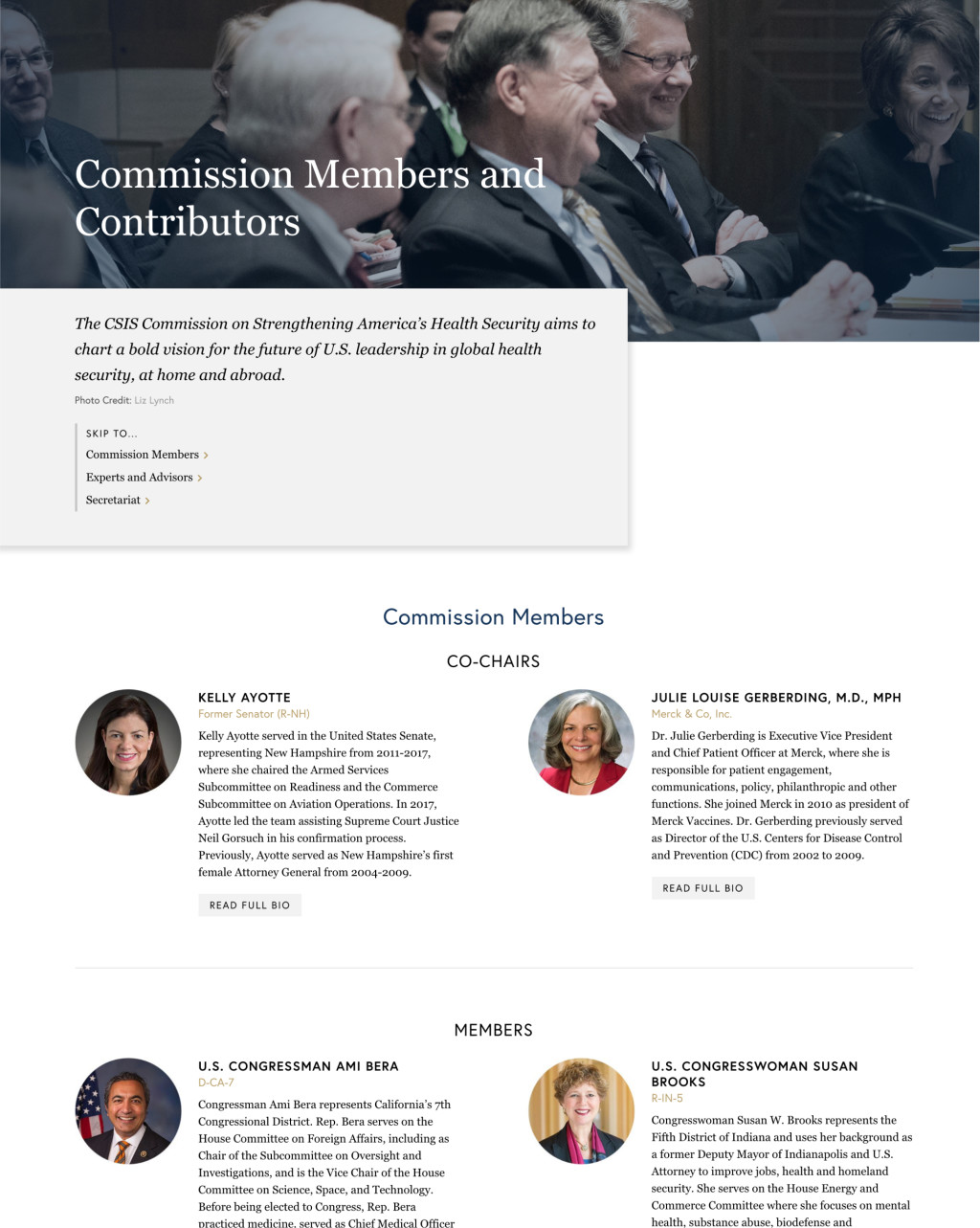
Ultimately, we divided the site into three buckets: information about the Commission and its activities, content produced by the members, and the Commission's culminating 2019 report.

Building balanced visuals
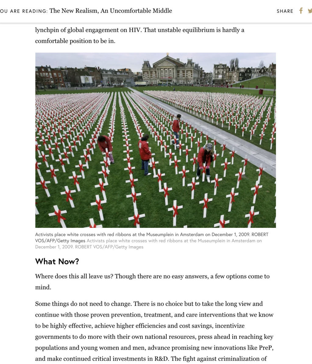
Our partners in the Global Health Policy Center did not want the visuals on the site to be too alarmist or gruesome. Understandable. Photos and graphics related to topics in public health can sometimes be a bit overwhelming, to say the least.

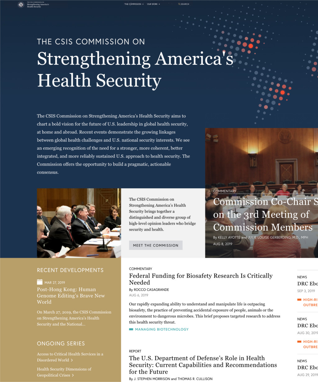
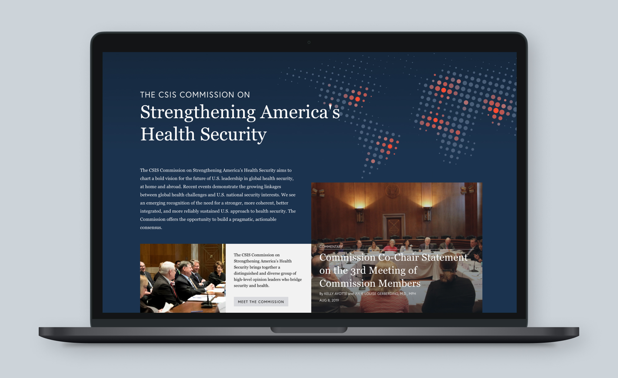
I decided that I could somewhat temper an overarching sense of doom with a strong color pallet. It made sense to go with dark blue (a nod to CSIS's brand), but secondary colors were equally as crucial. Although a small amount of red is used in the logo, covering the site in the hue would appear a bit on the nose and dire. But the dusky gold and light grays lend warmth to the palette and soften the sharp contrast of dark blue on white.
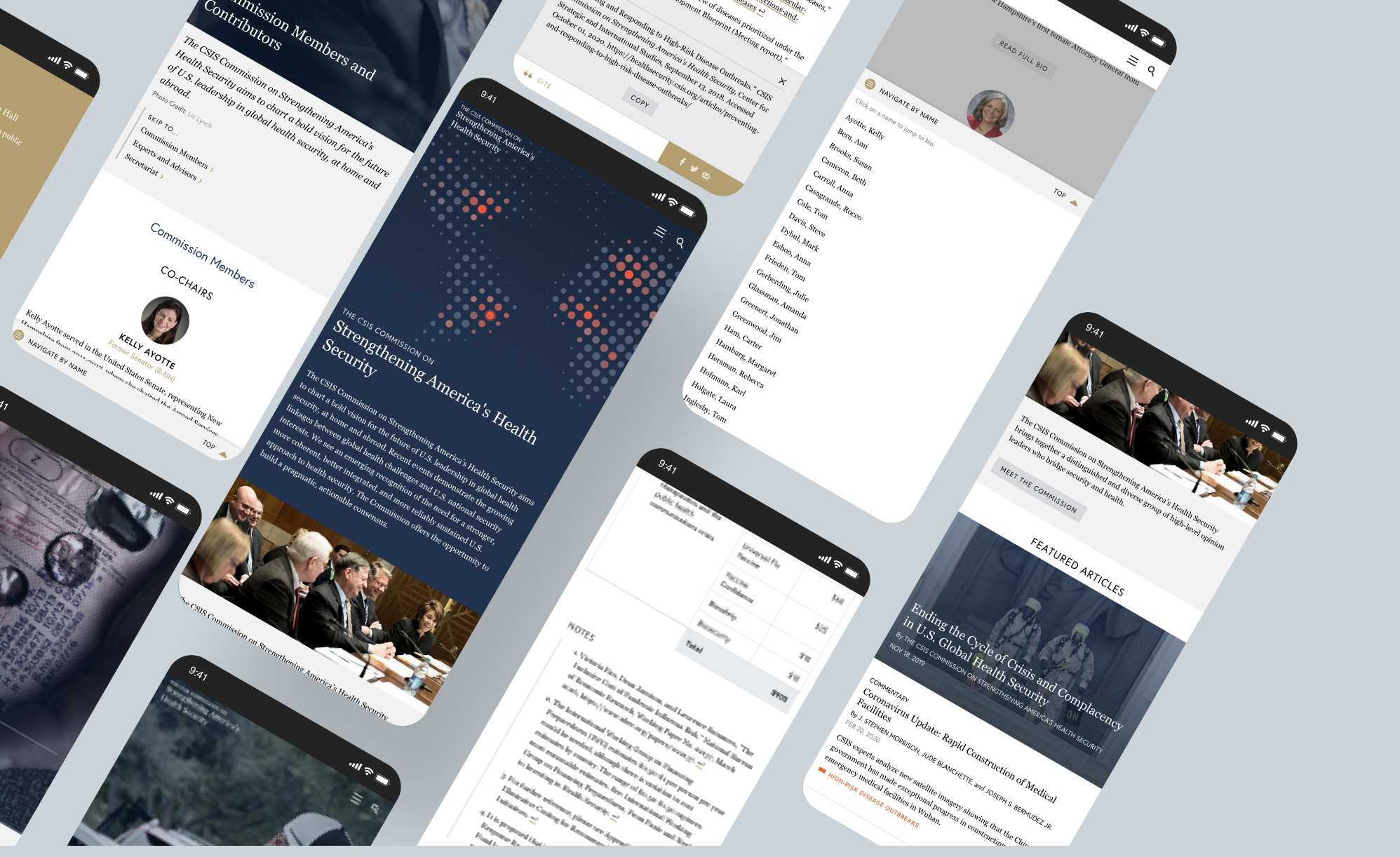
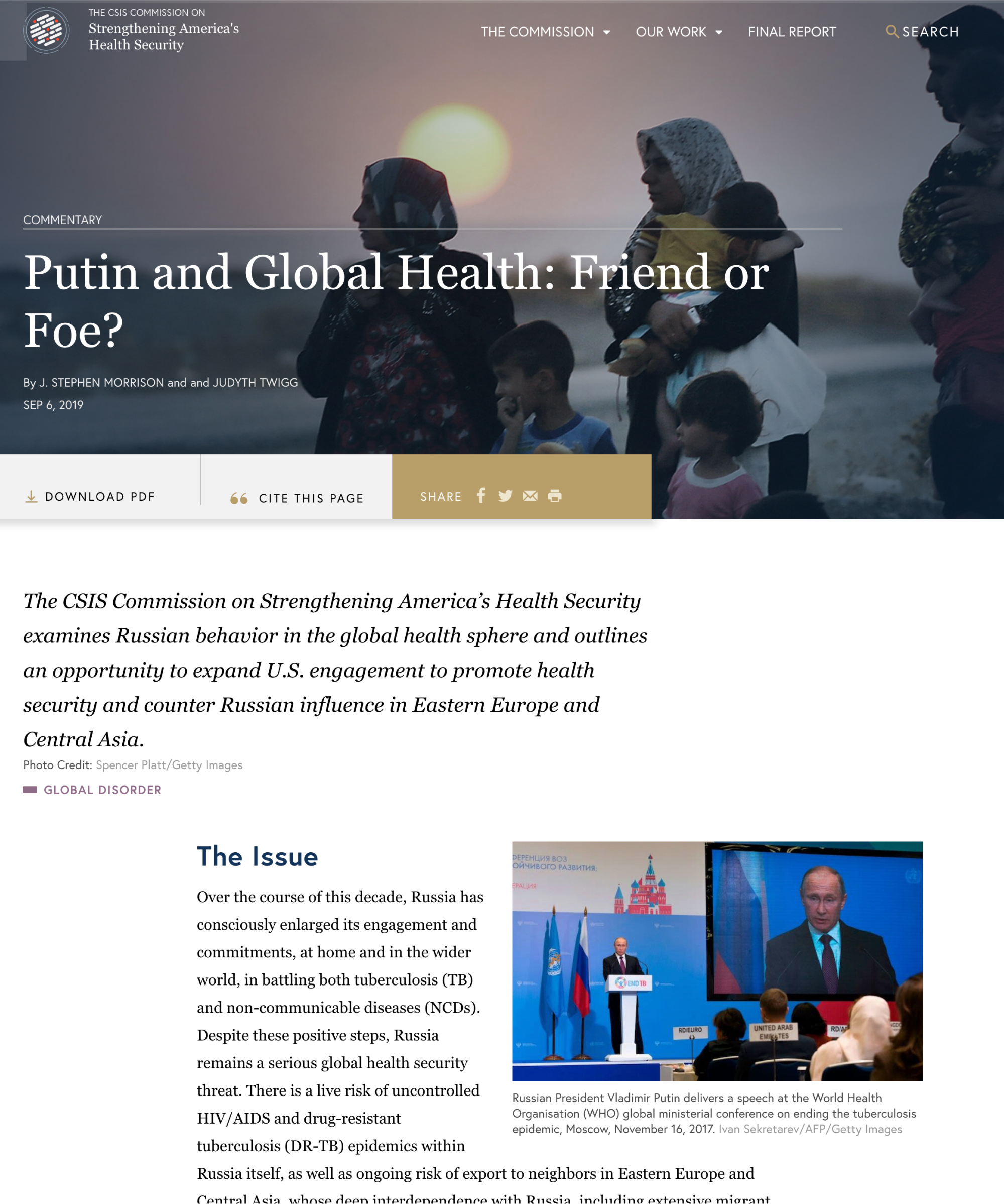
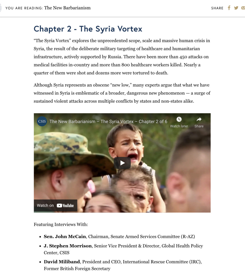
After a few conversations with the client, it was apparent that the photos were not always going to be (1) available or (2) feature subjects they wanted to splash on the top of a page. However, the Health Policy team wanted to have some kind of visual interest in the post headers.
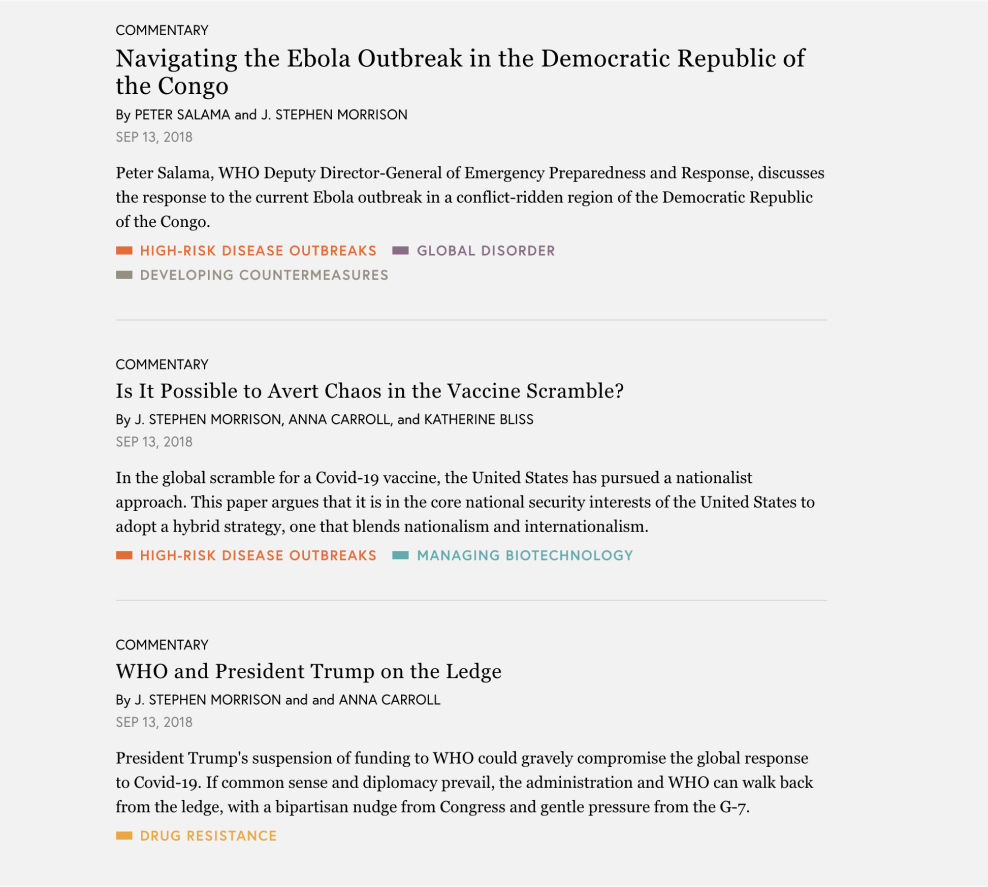
My solution: work with the client to choose photos that would represent the five categories. Each post would be assigned a "primary" category, and the representative image would appear in the post header background.
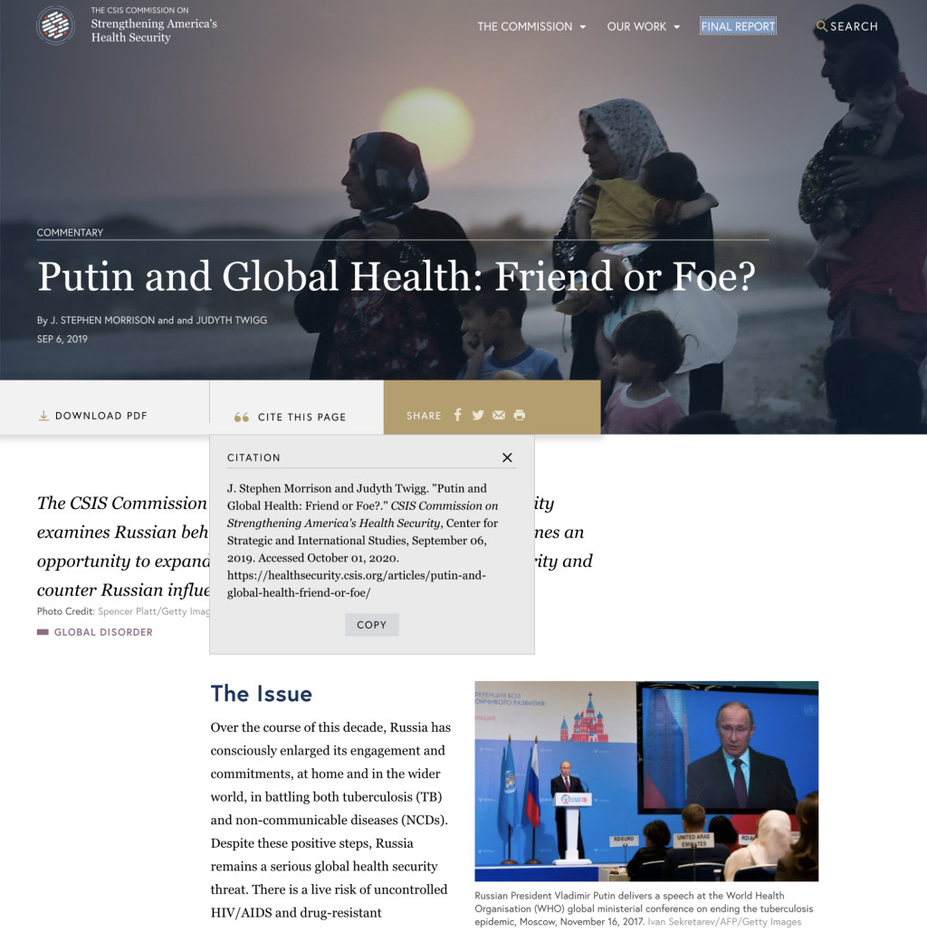


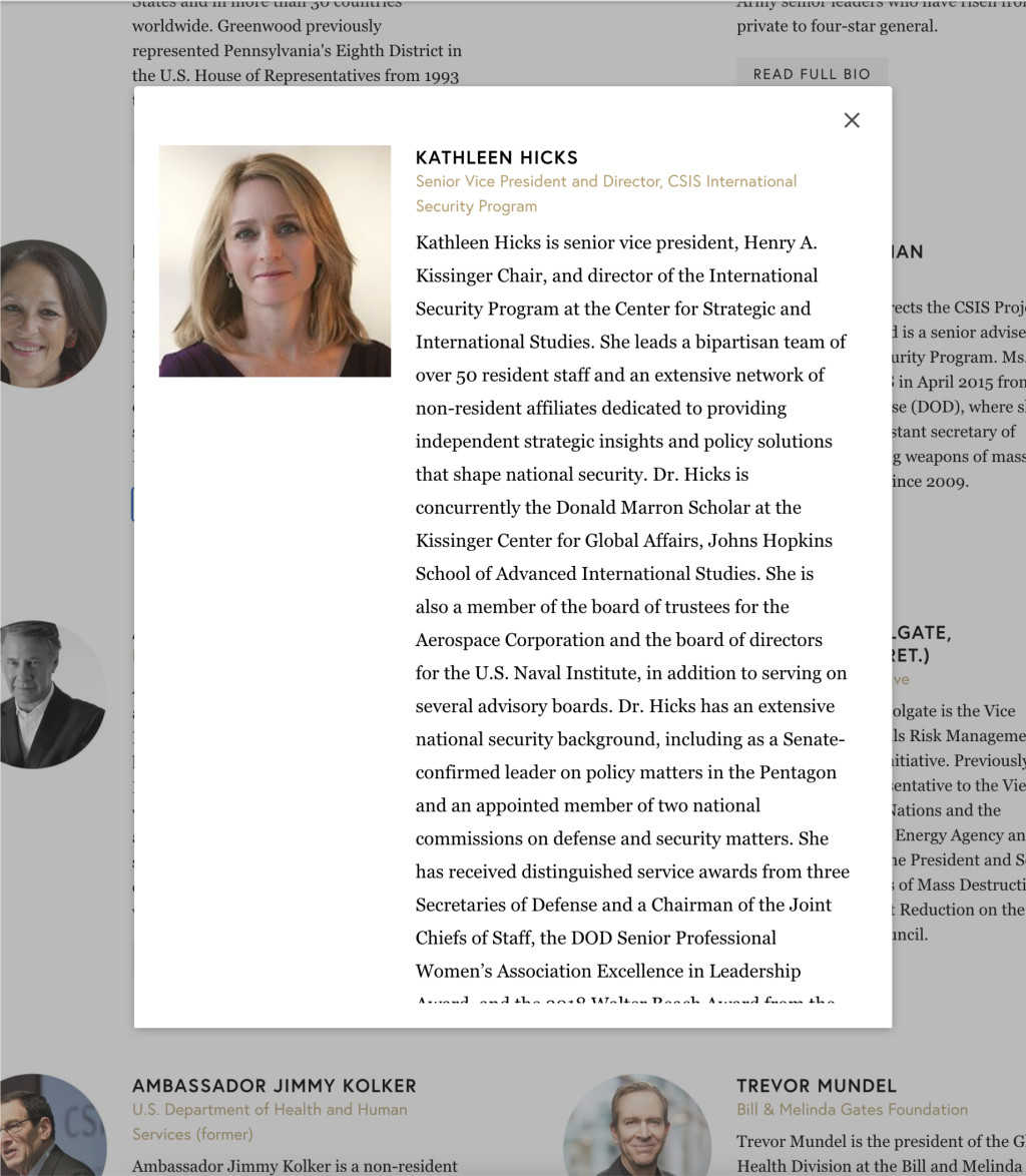
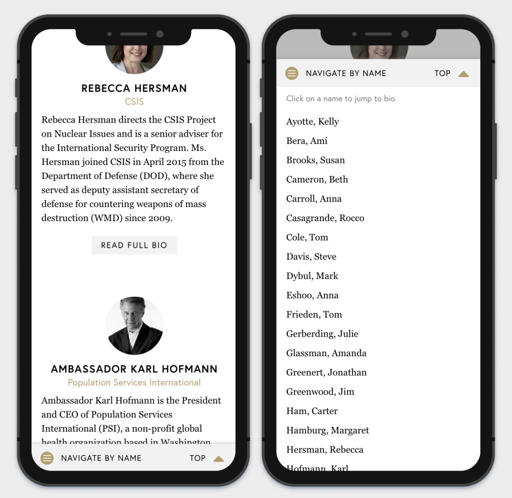
To maintain visual continuity, most of the pages (e.g. archives and category landing pages) have header layouts similar to the posts, and I worked with the client to pick out appropriate photos for these headers. Particularly with the "Commission" pages, I wanted the photos to (1) showcase the commissioners at work and (2) keep their faces as close to the center of the photo as possible (so heads would still be in the frame at different screen sizes).
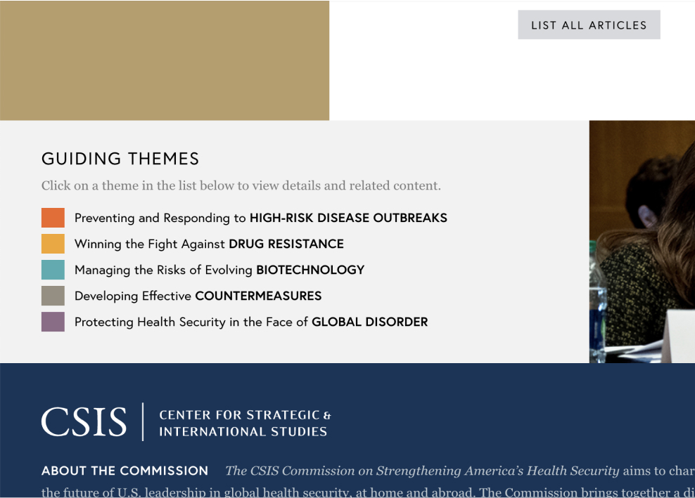
Categories
The category names were really quite long.
Preventing and Responding to High-Risk Disease Outbreaks
Winning the Fight Against Drug Resistance
Managing the Risks of Evolving Biotechnology
Developing effective Countermeasures
Protecting Health Security in the Face of Global Disorder
I knew that the layout would get extremely unwieldy and its scanability would decline any time more than one category was listed; particularly in the post blocks on archive pages.
To optimize the appearance of the categories in listed instances, I worked with the client to develop shorter versions of the category labels and assign each a specific color.
Reflections
To this day, this site design remains one of my favorites. Of course, there are little things here and there that I could tweak, but overall, it was extremely successful. The Global Health Policy Center staff has continued using the site long after the Commission term ended, and I'm proud that one of CSIS's most important programs can use this site as a means to push the health policy forward in America.