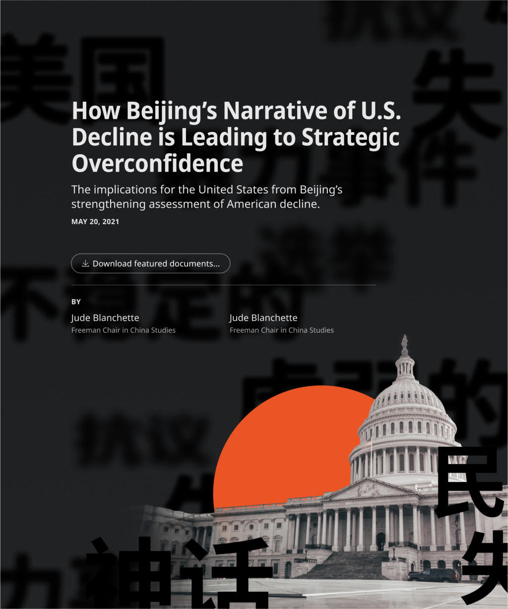
How Beijing's Narrative of U.S. Decline Is Leading to Strategic Overconfidence
This long-form article analyzes a selection of translated materials from Chinese media on Beijing's response to the attack on the U.S. Capitol on January 6, 2021.
About
During the Cold War, the US Government funded the translation of Russian and Korean documents and made them available to researchers. Those efforts have now died down, despite concerns about China growing as a strategic threat to the U.S.
The Open Source Analysis Project at CSIS aimed to increase the number of translated material available in order "to drive in-depth discussions and debates on strategic topics" relating to U.S. foreign relations.
This is the pilot article in a series where CSIS experts examine a selection of primary source materials through the lens of a current event or topic related to China. We hoped to better understand Beijing’s "ambitions, intentions, strengths, and weaknesses" as the competition between the USA and China continues to escalate.
This piece focuses on Beijing's response to the attack on the U.S. Capitol on January 6, 2021.
We're building... something
To quote a colleague, the scope for this project was very "squishy" when we first started working with the Open Source experts. No one was sure what form the project would eventually take, so we decided to start small with a single long-form (that could potentially evolve into a series of long-forms).
The experts settled on a topic for the piece and outsourced media translations for use in narrative development and asset production. After a couple of conversations with the experts, I sussed out their target audiences and objectives, but the pieces of the narrative remained scattered.
We needed a way to help the experts determine what form the translations should take alongside the (yet to be written) analysis. So, I scoured the web for a range of examples showing how others had integrated original documents into narratives. We reviewed these together, and our discussion helped them narrow down the organization patterns that best suited their content and objectives.
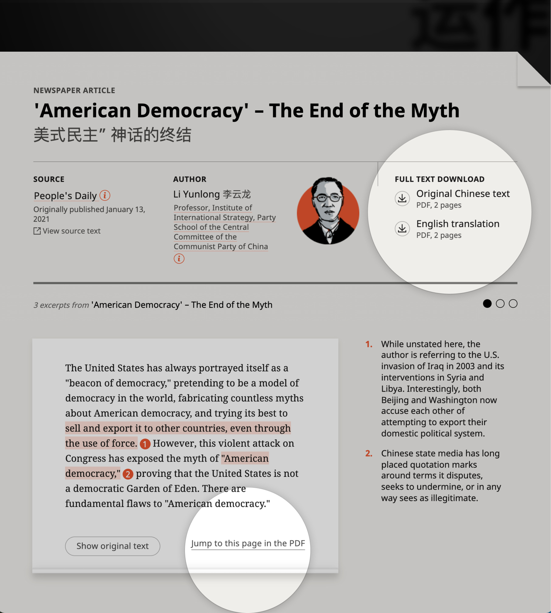
Several outlines and drafts later, we were able to get a better look at the content we needed to prepare for. Excerpts from the translated documents were grouped into "themes" or sections that supported the main argument of the feature. Since the bulk of the article would be examining those excerpts, I focused most of my attention there; developing two low-fidelity prototypes that approached the layout and functionalities of these sections in different ways.
The final product reflects the card-layout approach. It gives the user more control over their scroll position and could be more easily adapted into a range of screen sizes.
The aesthetic for a series
After digging into the content a bit more, it was time to figure out what the aesthetic would be. I developed a few theme options that suited the overall mission and tone of the project.
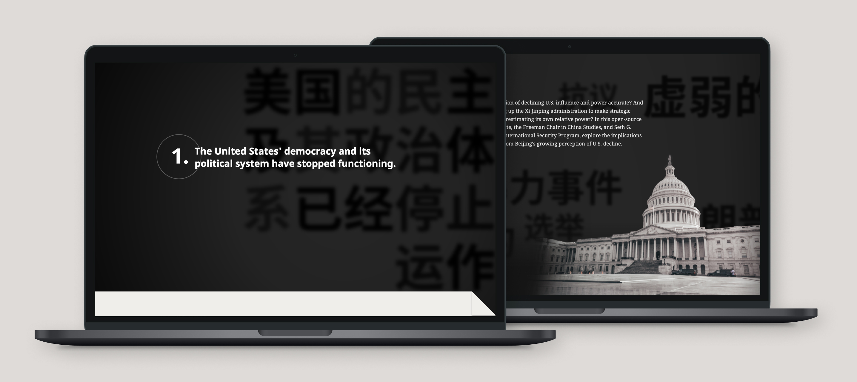
We settled on the one I called "Lens Focus"; it highlighted the authors' goal of focusing on translations and providing a lens through which the audience could better understand the nuances of the Chinese state's narrative. Visuals would include blur transitions, large typography, and a play on depth of field.
Because the project was primarily concerned with translated documents and communication, I took typography and colors from old newspapers and propaganda posters. Although the black and red combo originally harkened back to early color printing, I shifted the red to red-orange to avoid negative or political connotations.
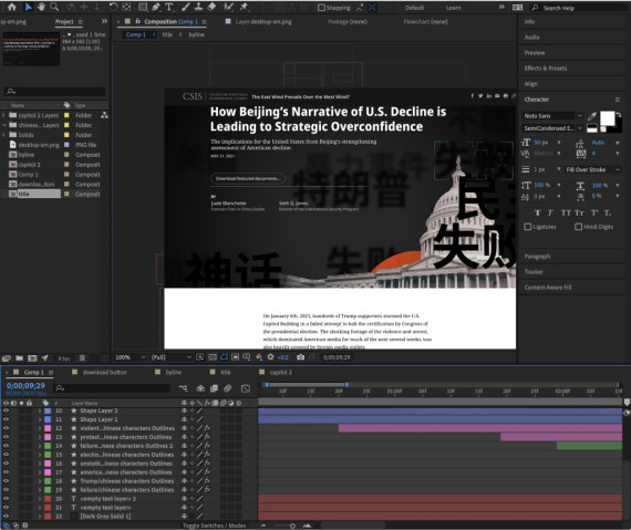
I dabbled more in After Effects during this project than I ever had before. The aesthetic leaned on transition and movement, so I made high-fidelity mockup videos and storyboards to show my team and clients the scroll animations and interactions.
After Effects came to my aid again when I was making measurements for the background characters in the article's introduction. A colleague gave me a quick tutorial on how to set up a camera view, so I was able to establish a more realistic size and speed calculations for the layers of moving characters.
A balance of flexibility and consistency
By the time I began building mockups, we had settled on making a series of articles. However, we would not be releasing them together, so the design still needed to stand on its own.
Where would there be consistent structures and design? How would I give each custom long-form the flexibility to adapt to its unique content while maintaining visual consistency with the rest of the articles in the series?
Accessible source material and credibility
The CSIS experts wanted to reach people who would benefit from a more nuanced understanding of US-China relations: policymakers, senior management of companies with Asian interests, journalists, and other experts in the research community. These audiences would be more discerning than the layman and would require transparency and evidentiary support before allowing the narrative to affect their decisions.
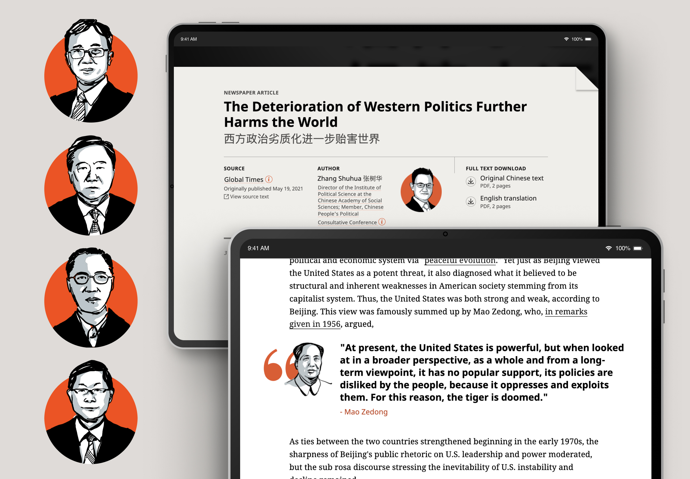
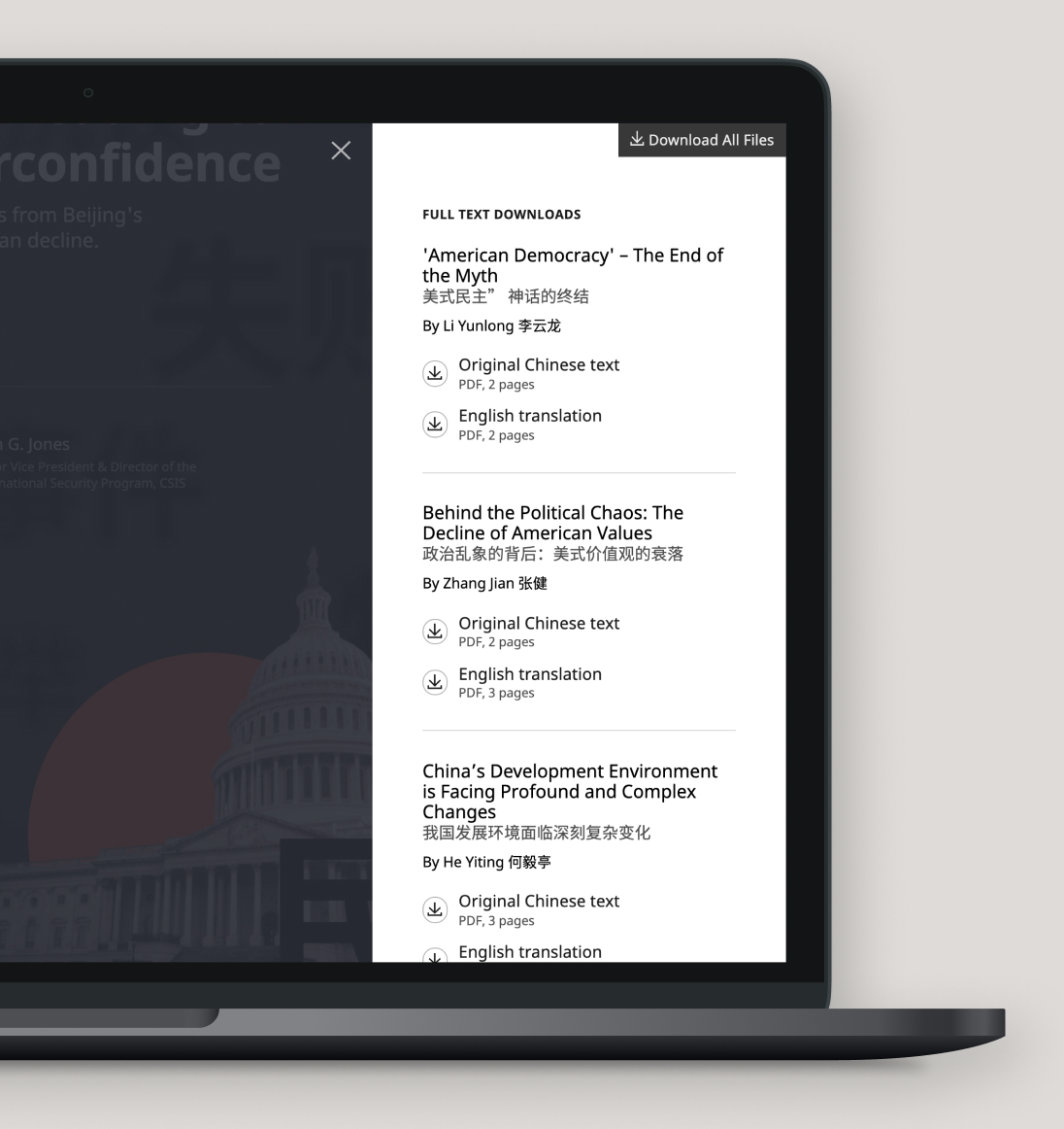
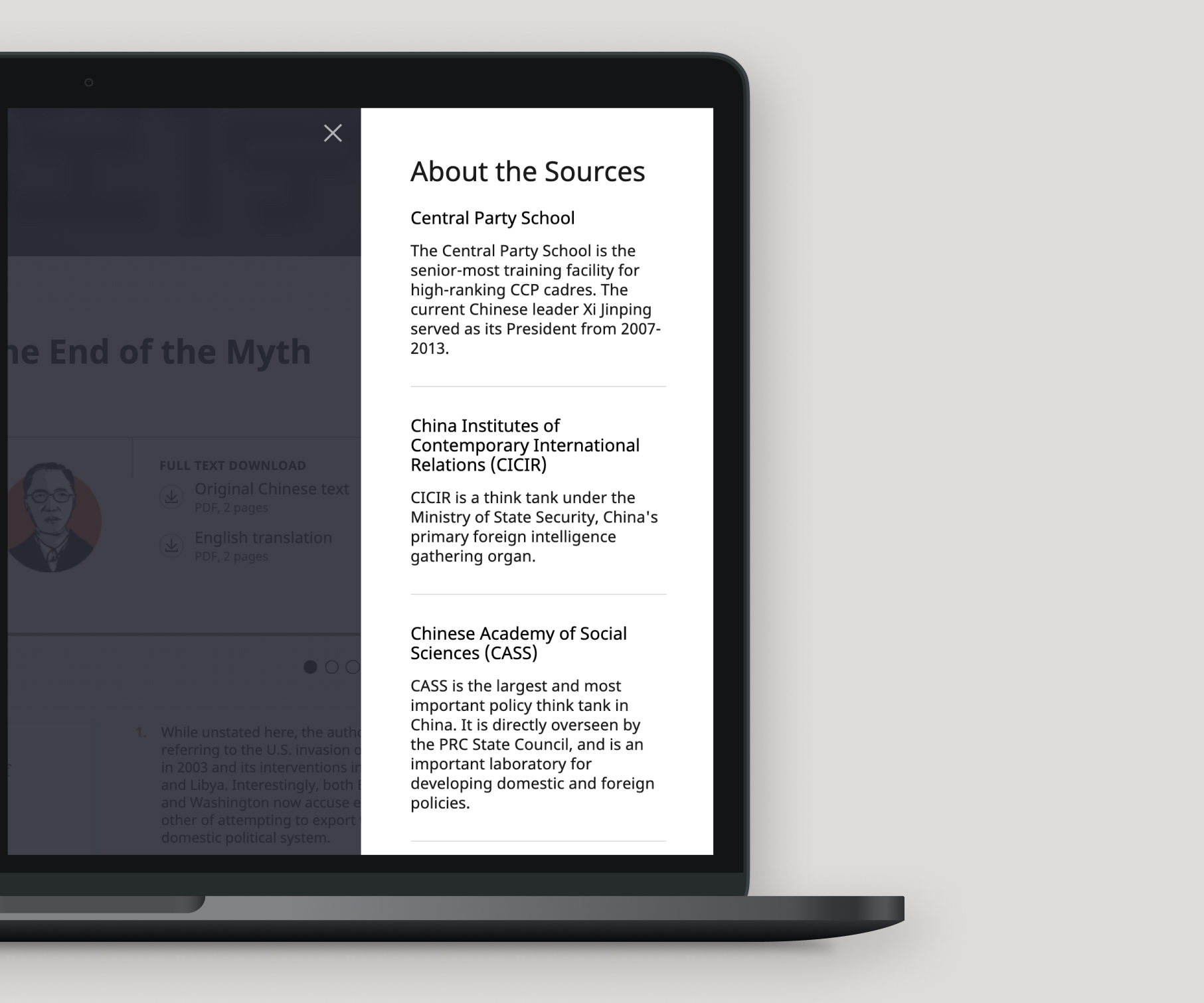
I wanted to take every opportunity to grow our credibility, such as providing multiple routes to the original material and emphasizing source information.
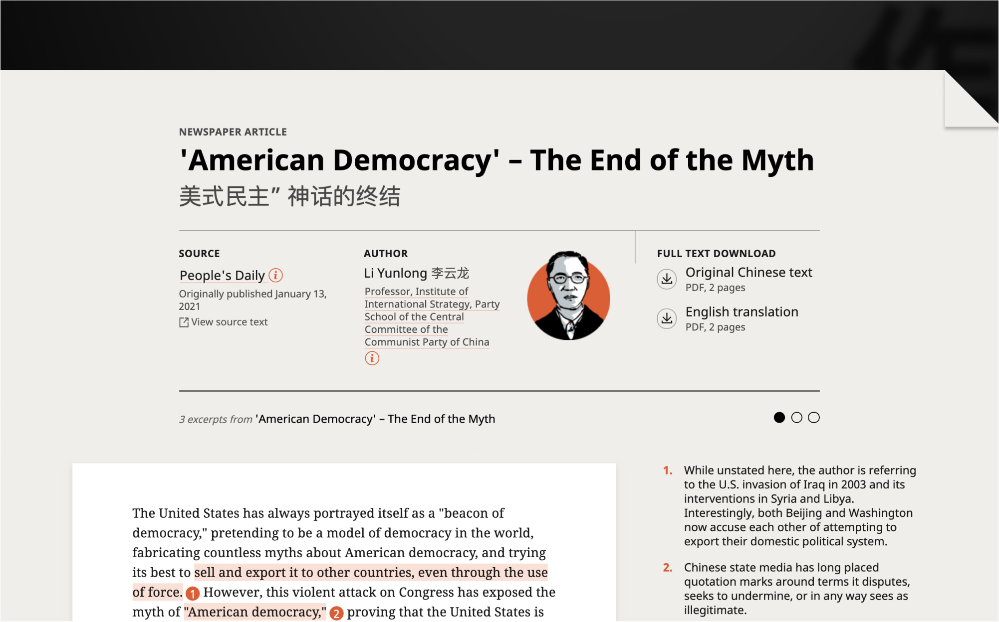
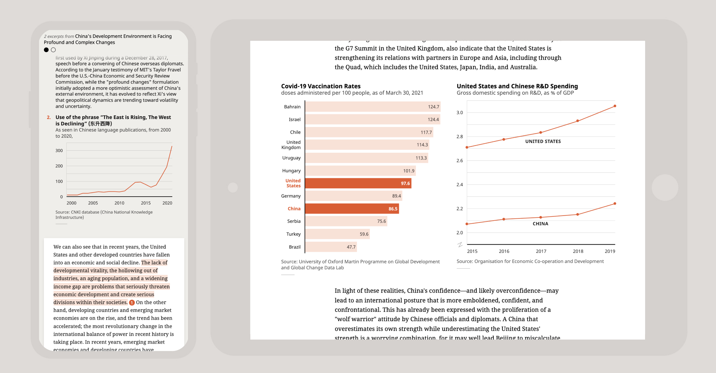
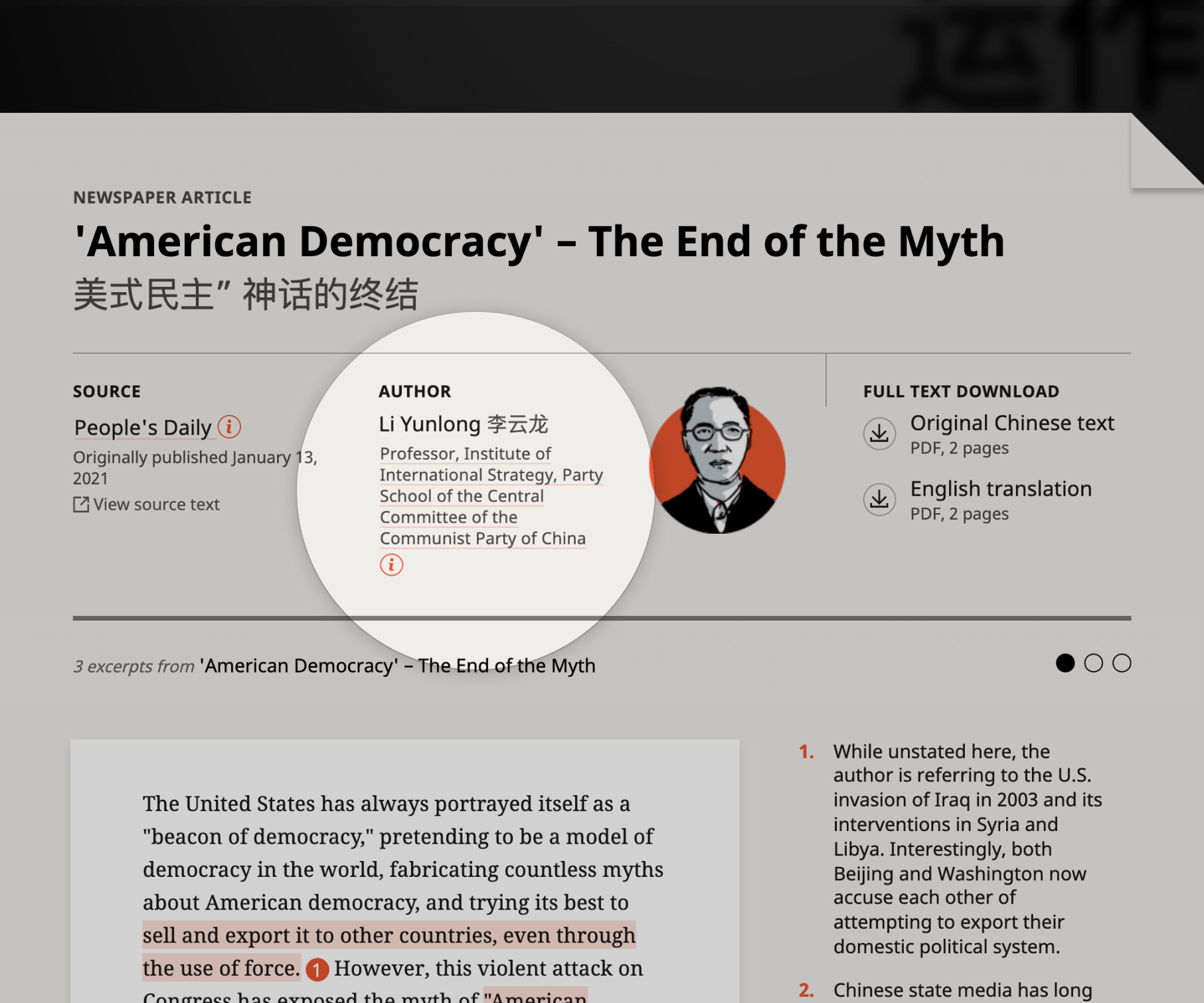
We wanted to be transparent about the source documents. Each document header highlights publication and author details, and the downloadable PDFs also include a Chicago citation for the original source.

Reflections
I truly loved working on this project and with Seth, Jude, and my team. The authors were always so receptive to our suggestions and enthusiastic as we led them through an unfamiliar process. I worked with colleagues from video production and publications to develop various media, and they were troopers for jumping into the project halfway.
This long-form was the first of several, so I look forward to seeing how these design and functionality strategies hold up as we publish more in the upcoming months.