The CSIS Journalism Bootcamp
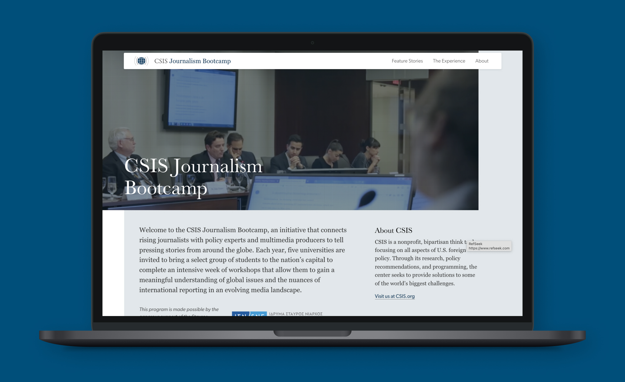
The CSIS Journalism Bootcamp connects journalism and international relations students with policy experts and multimedia specialists to share pressing stories from around the globe.
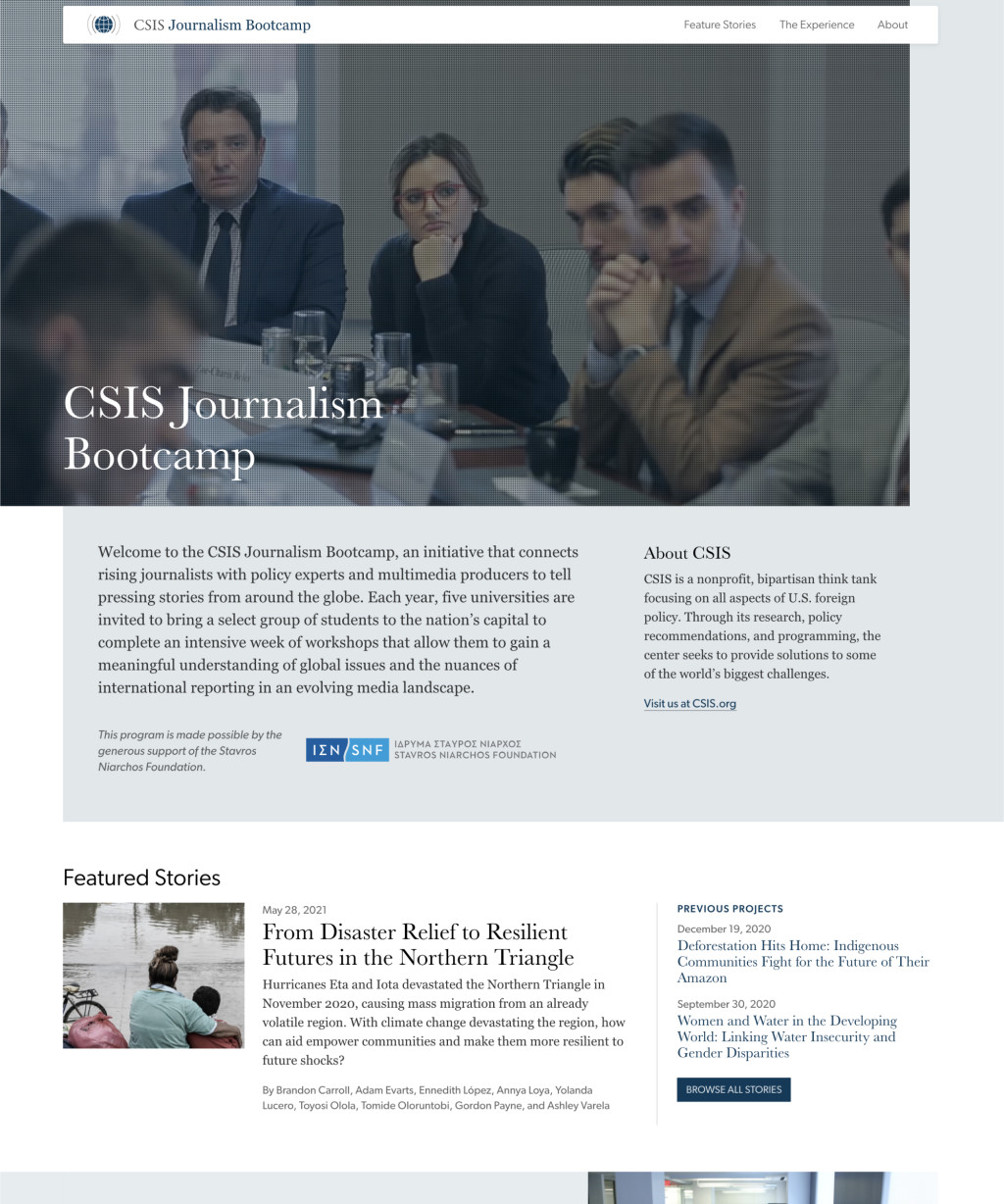
About
The CSIS Journalism Bootcamp is an initiative between the Executive Education program and the iDeas Lab that connects rising journalists (mostly undergraduate) with policy experts and multimedia producers.
Sponsored by the Stavros Niarchos Foundation, each cohort (one professor and approx. fifteen students) from a particular university attend an all-expenses-paid trip to DC for a week. Before arriving, the students choose a topic they would like to explore, and my colleagues put together background content—from readings to videos—for the students to study before arriving in DC.
During their week in DC, the students meet with relevant experts on their chosen topic (both inside and outside of CSIS) to narrow their story’s focus and build their understanding of the topic.
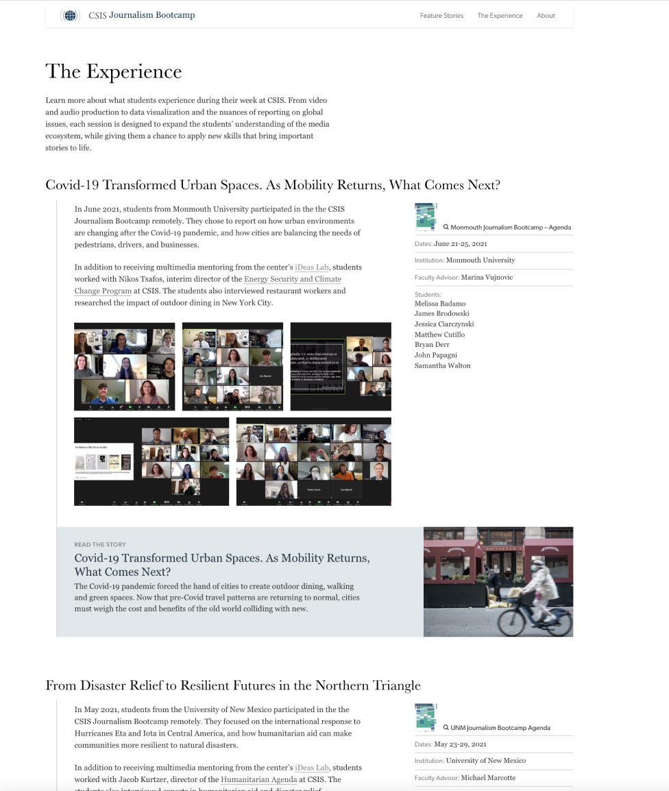
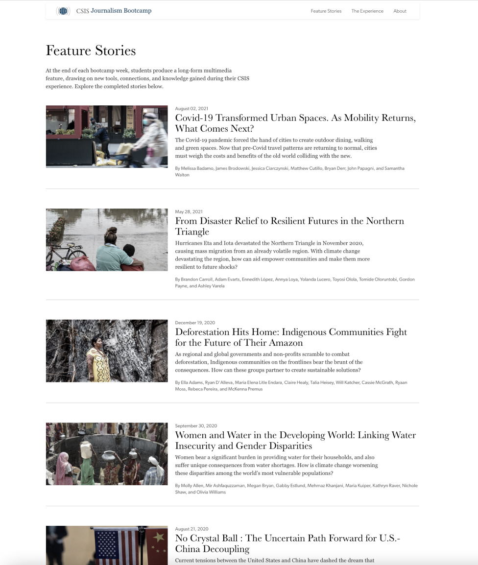
They are also broken up into teams, each headed by members of the iDeas Lab, to work on multimedia for their story. By the end of their week in DC, the students should have created a long-form article for the web that includes data visualizations, video, and audio elements.
Since the bootcamp launched in 2018, its popularity has grown significantly, and CSIS now hosts about six cohorts a year.
I have two roles in this initiative:
Designer and developer of the website where the stories are constructed and published
Co-leader of the web/story team
Wearing these two hats gives me a unique perspective because I’m more intimately involved with my client(s) and the content they are creating. Since its initial launch, I’ve used my experiences alongside these young journalists to improve the site, particularly as I conducted a major redesign and integration with the WordPress Gutenberg editor in 2019.
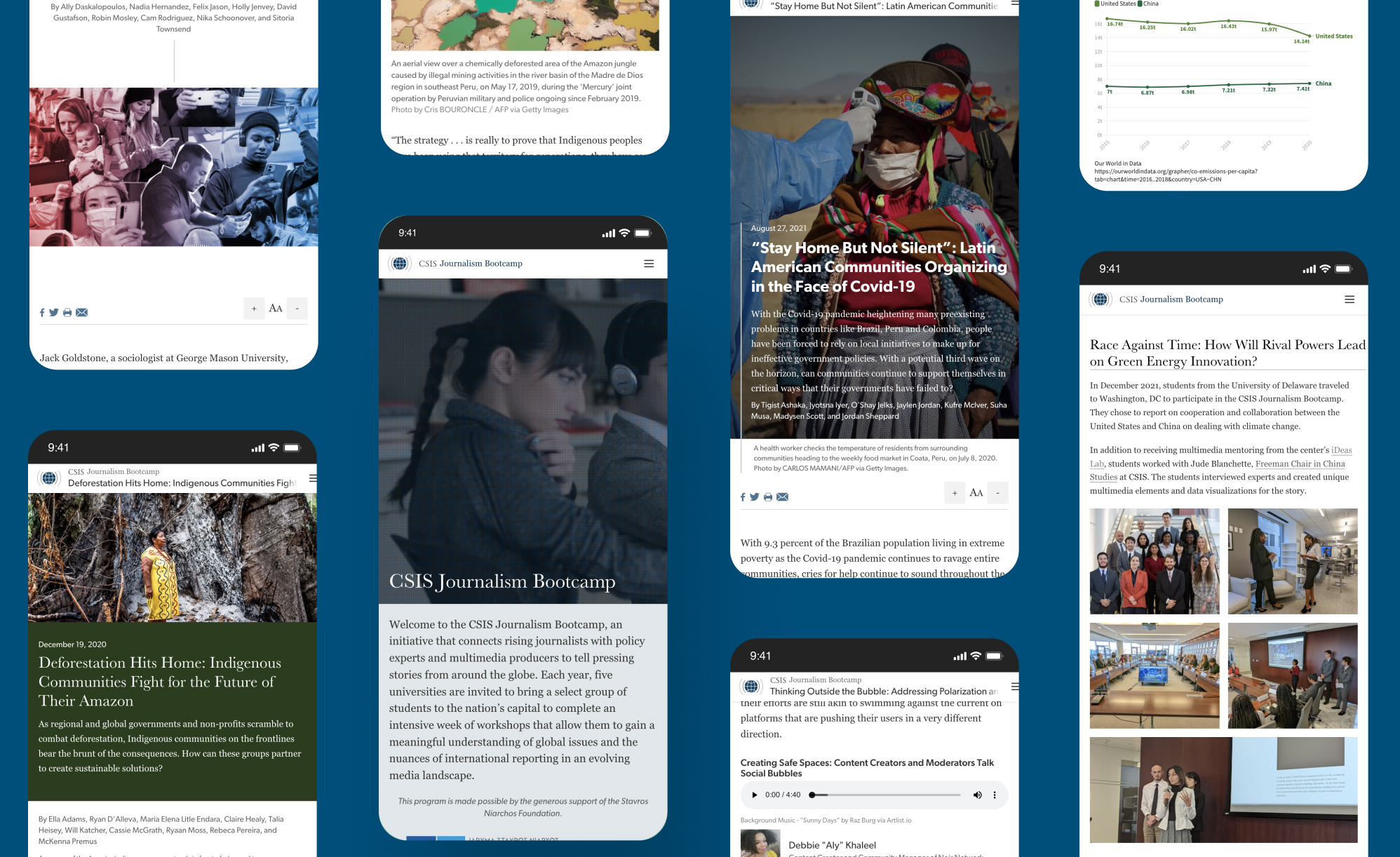
The narrative's building blocks
I did (and still do) a lot of poking around the internet to see what kind of components I needed to design and build for the students. The visual elements for the story needed to be produced within a five-day period, so I wanted it to be possible for a user without development skills to build one in the WordPress editor.
After discussing a shortlist of options with my team, we paired down the component blocks to include:
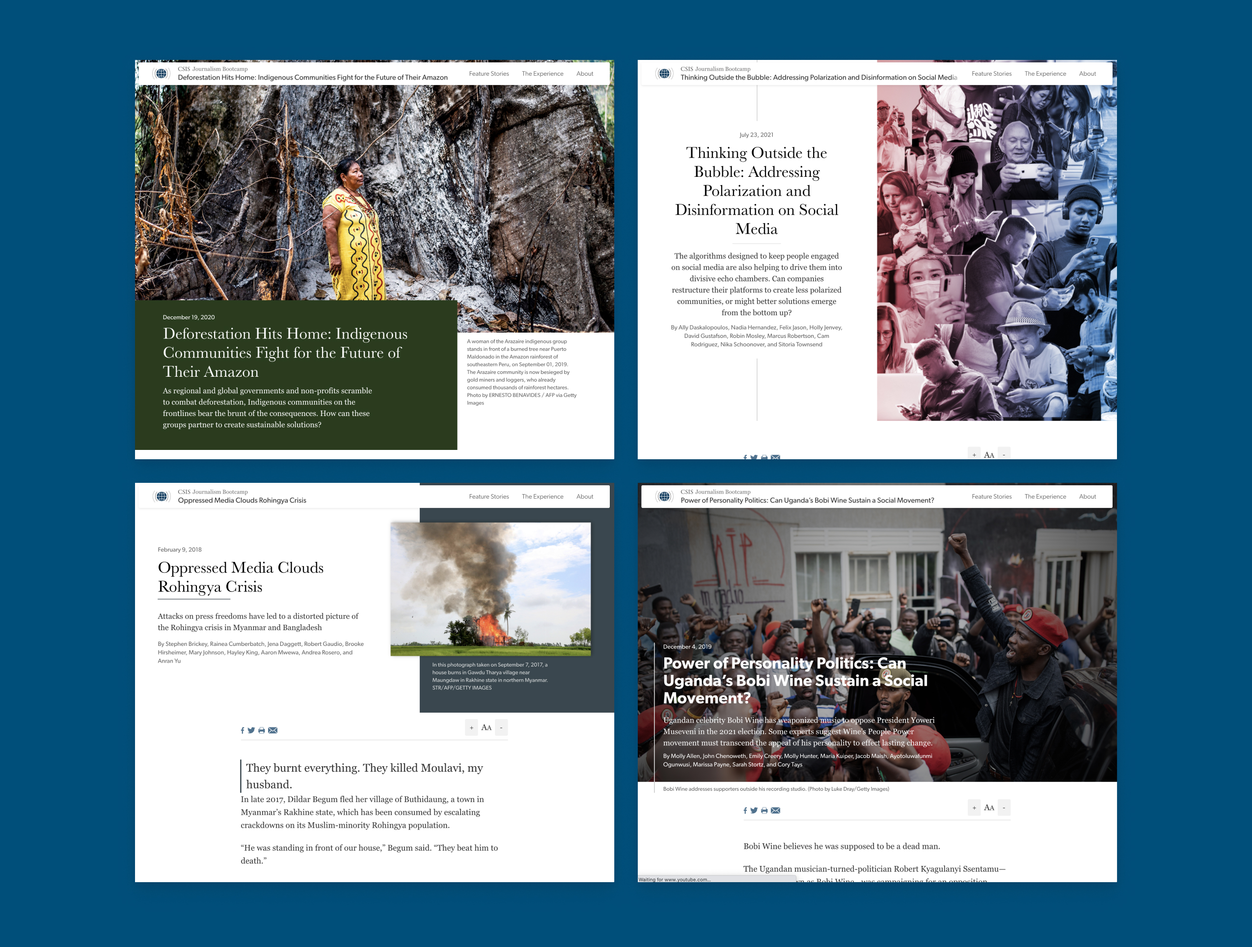
Video player: Produced by the Video team; most of the videos are stored on Vimeo, though some are produced by the Data Viz team and stored in the CMS
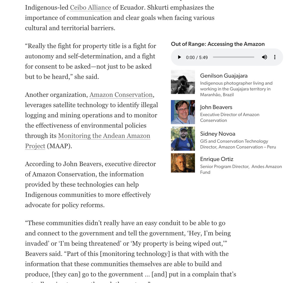
Audio player: Produced by the Video team; player includes the ability to add images and names of participating voices
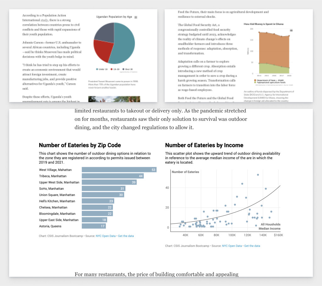
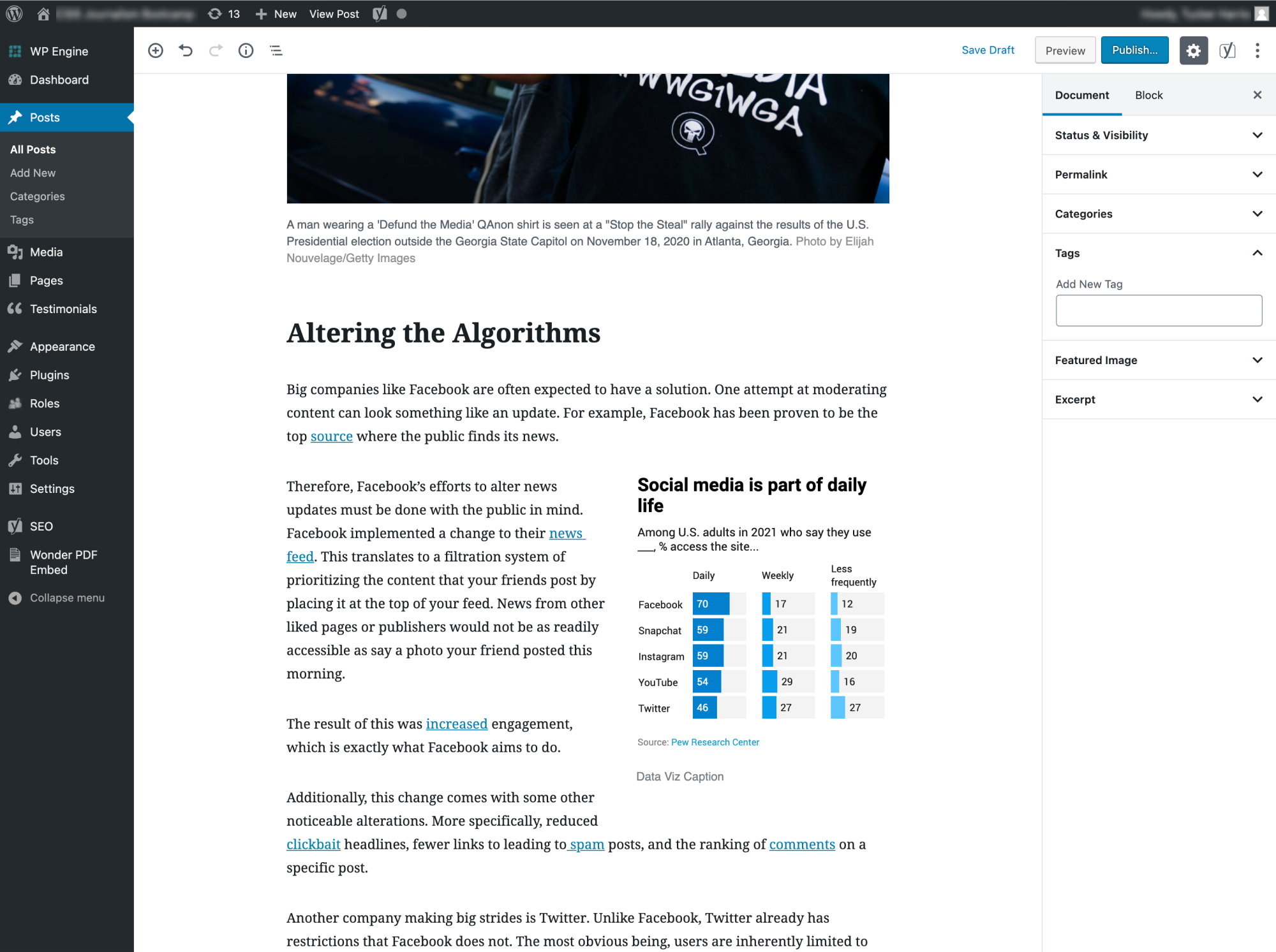
HTML: Mostly used for embedding data visualization (maps, charts)
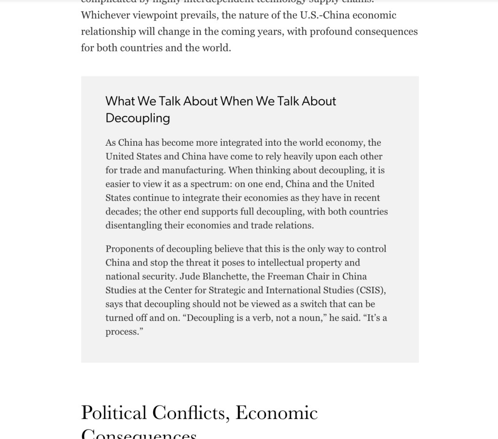
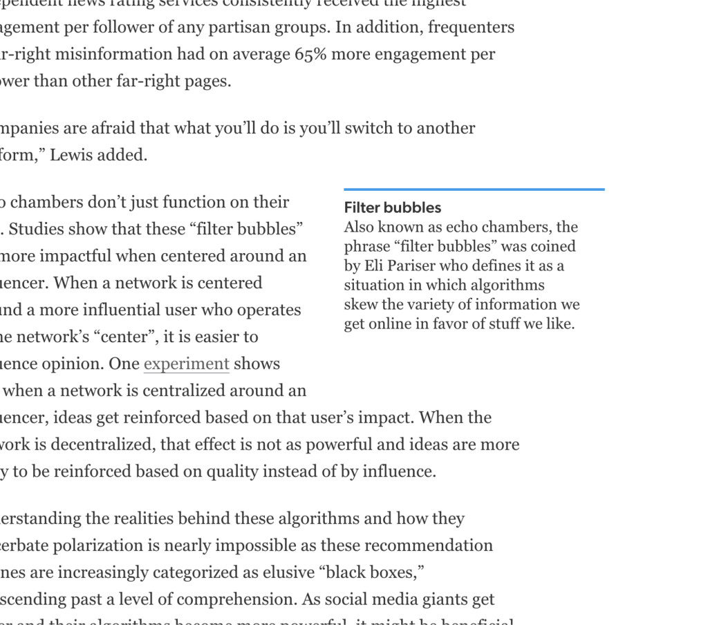
Aside blocks: Provides a designated area for related content, such as jargon definitions or case studies
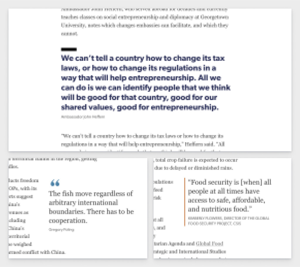
Block quotes
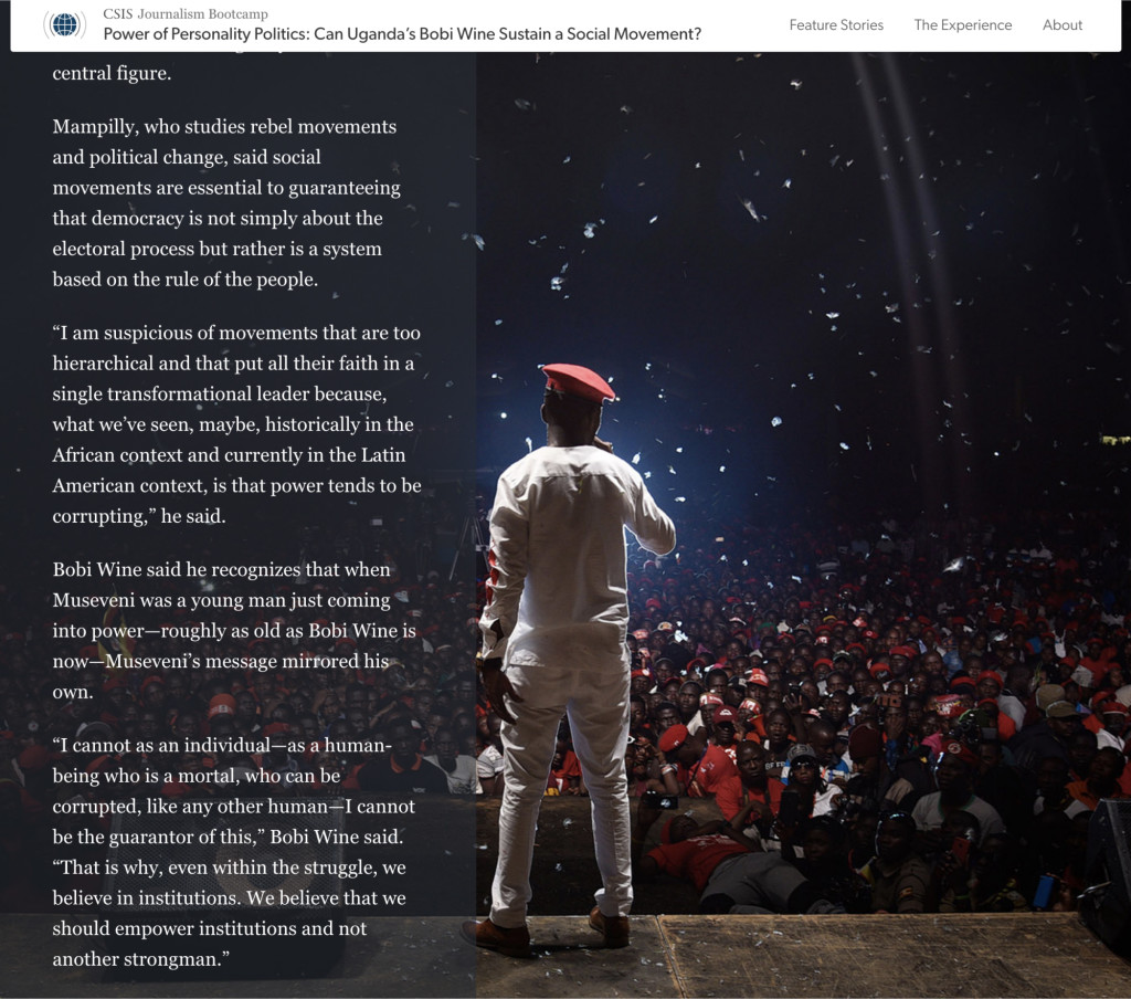
Text Overlay: Text scrolling over a full-screen background image
Profile image: A small photo of a person or a locator map graphic for additional context
Style foundations
The base style was inspired by the CSIS brand:
Color: CSIS brand's dark blue was adopted as the base color, and I added a brighter blue to infuse a bit more energy into the palette. We were, after all, working with the youths.
Typography: To emulate the scholarly, journalistic feel of the CSIS site, along with other major news websites, I chose serif fonts for the body copy and headings, while a sans was used for secondary level content like captions. I did not spend much time re-evaluating my typographic choices during the site redesign in 2019, but I do wish I had spent a bit more time finding font families that harmonized more, particularly between the letterforms. I would also reconsider the serif I used for headings, potentially opting for one that has a less dramatic stroke contrast.
Controlled tailoring
Each post is a separate story created by a different group of students. By allowing them some flexibility in the style of the article, I hoped to teach them a bit about how even small design decisions can affect comprehension and perceived credibility.
However, there needed to be a balance between creative freedom, visual variation within the story itself, and the site’s stylistic continuity. So, I was strategic about which elements were given such flexibility; attempting to make those decisions neither too limiting nor overwhelming for the young journalists.
Development
During the first iteration of the site in 2018, WordPress’s classic editor did not provide an easy way for the students to add content in an intuitive way. I decided to use a plugin to override the editor because it allowed me the flexibility to curate the components offered and to create my own.
However, the interface was still very complicated. There were layout functionalities that we did not need, but I couldn’t remove them from the plugin. The editor was actually not very “visual” or flexible, so I often found myself undoing and redoing the layout, flipping back and forth between the builder and the page preview. Collaborating with the students on the final product was a nightmare!
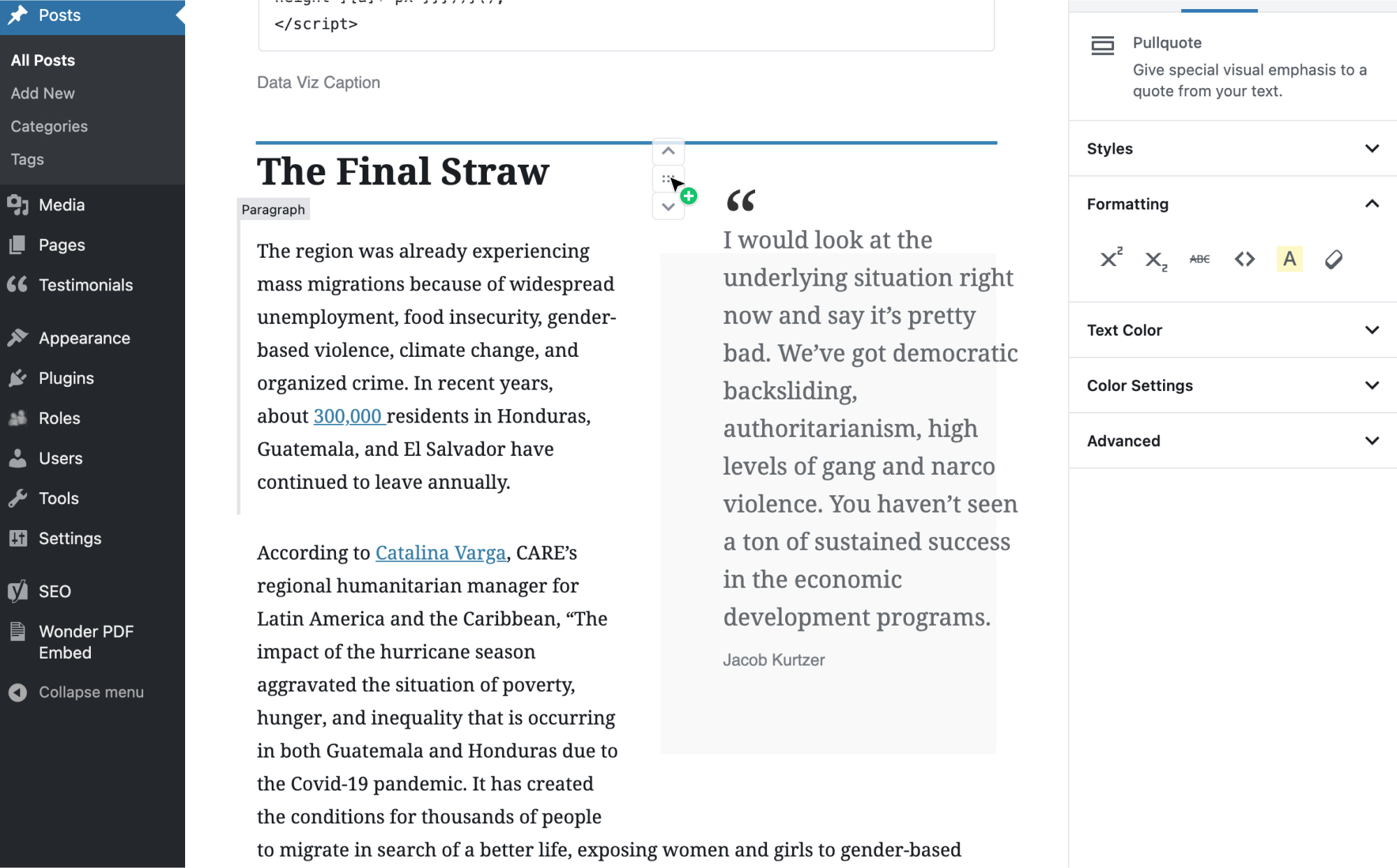
A year later, WordPress released Gutenberg. I slowly familiarized myself with block development (which was pretty difficult, due to the sad lack of documentation on its release) and finally managed to build my own plugin that removed unnecessary blocks and added blocks for the custom components I designed.
Overall, the Gutenberg interface was MUCH more usable, particularly when our team was rushing to meet the Friday deadline.
There are, of course, drawbacks to the Gutenberg editor. As a designer, who didn't want to offer post authors too many extra style choices, I ended up having to use some hacky JavaScript in order to hide certain parts of the interface (e.g. font sizes and text colors).
Reflections
I was given very little time to design and develop the first iteration of the site before the arrival of the first student cohort (about three weeks), and none of my colleagues were quite sure what final form the content would take.
Due to the lack of interest in seeing mockups and the very small amount of time I had to actually code the site before it needed to be in use, I only created rough outlines of the homepage and post pages. This is one of the BIGGEST lessons I have learned as a designer and as a developer: always always always take the time for mockups. I don’t know how many times I ended up re-doing code because I changed my mind on how to style something or I figured out too late that the design wasn't balanced. Plus, my SCSS files were an utter mess. Never again.
Apart from the fun I had as the designer and developer of this site, I loved being a part of this project because I was able to learn more about journalism. Several of my colleagues worked in the industry before working with me at CSIS, and seeing how they guide the students’ stories is incredibly interesting. The care they put into the narrative and the energy they bring to creating the video, audio, and data pieces was always inspiring and made me want to collaborate on projects with them even more.
