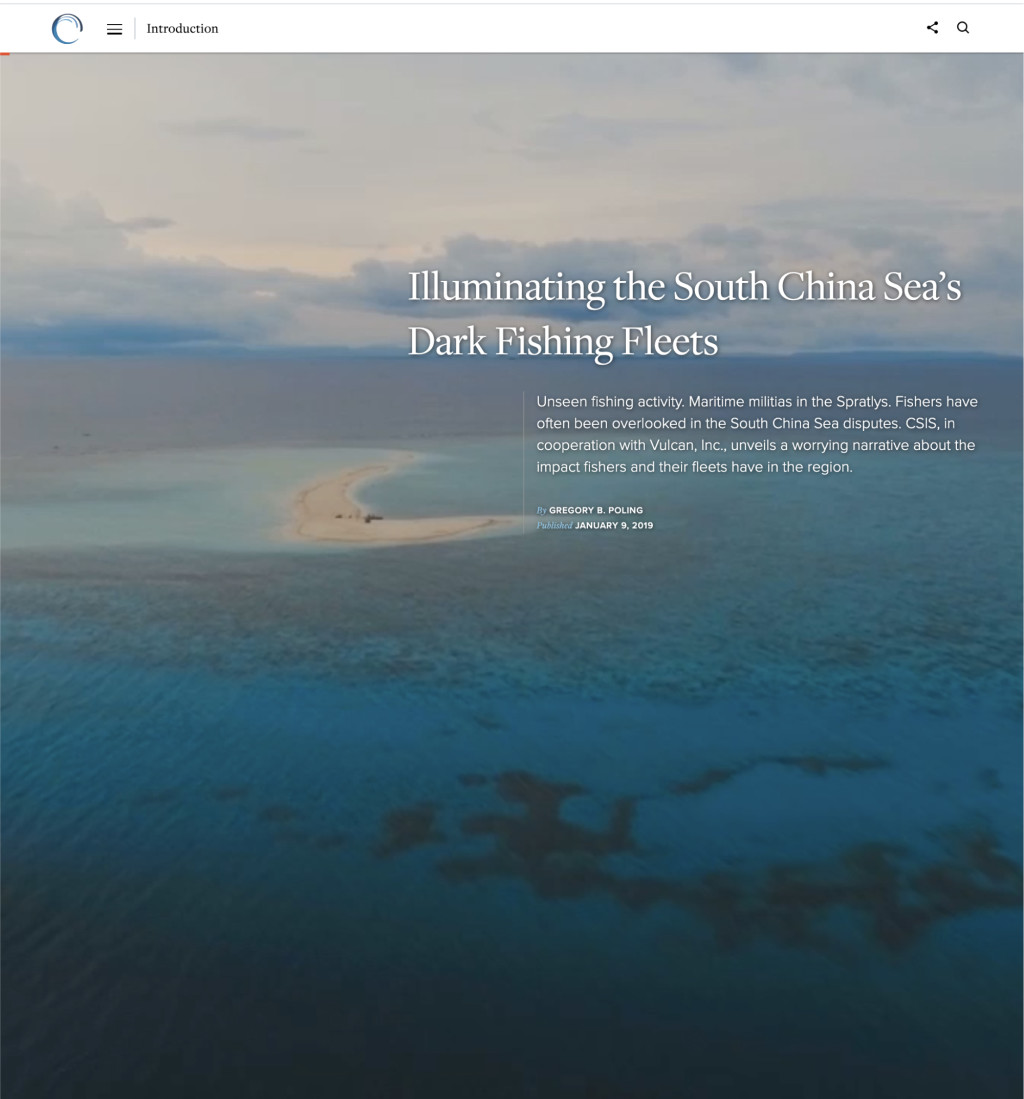
Illuminating the South China Sea’s Dark Fishing Fleet
Gregory Poling leverages previously underused technologies and data sources to analyze the size and behavior of fishing fleets in the most hotly-contested part of the South China Sea, the Spratly Islands.
About
The Stephenson Ocean Security (SOS) Project examines the intersection of ocean health and global security, focusing on the ways ecological and socioeconomic changes interact to drive competition for marine resources and how such competition contributes to instability and geopolitical risk.
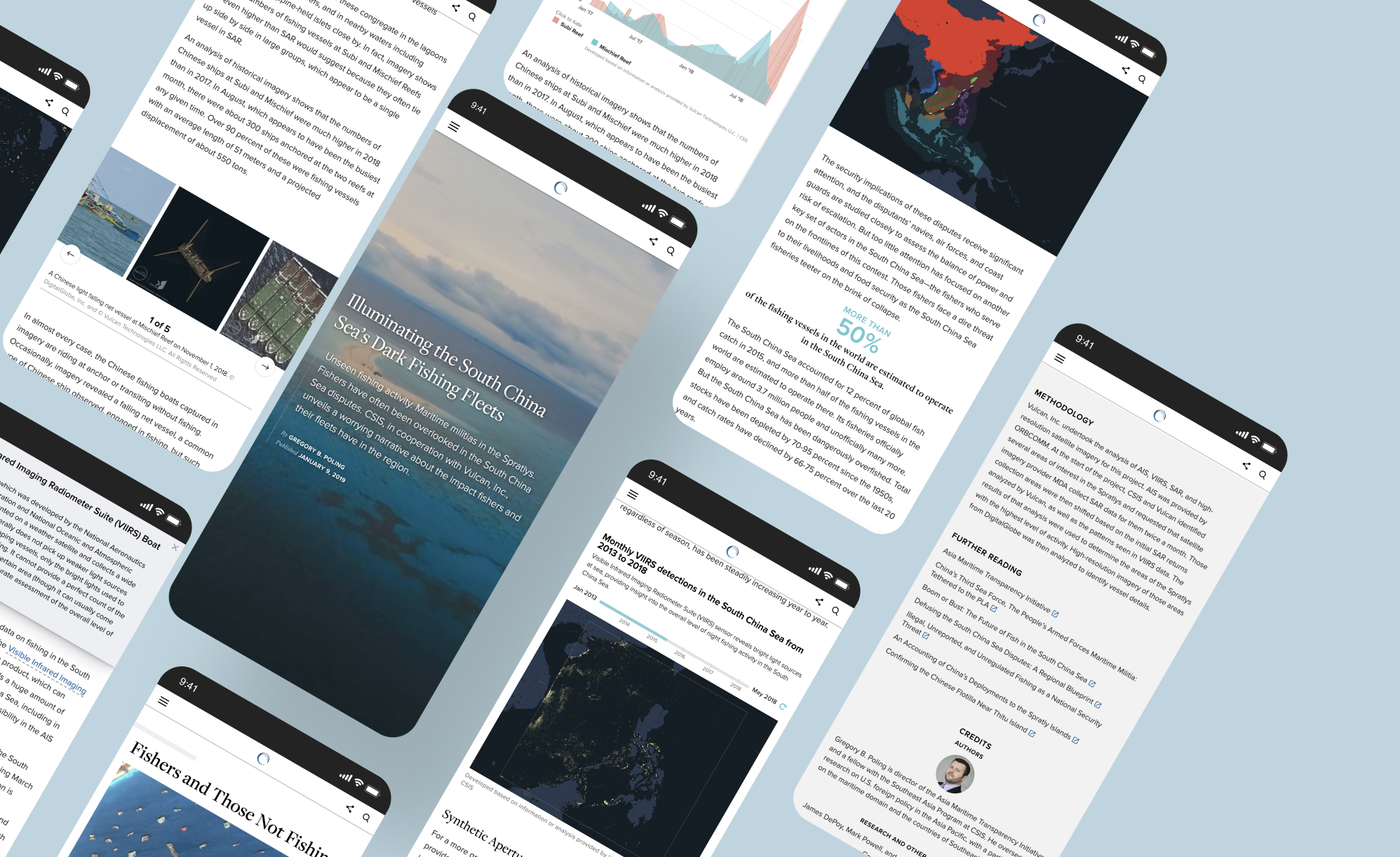
One of the projects' goals was to publish a series of "Spotlights", media-rich long-form essays written by CSIS content experts. My team, the iDeas Lab, would assist with creative direction, visual asset creation, and development.
“SOS Spotlight projects provide in-depth analysis and novel research on regionally specific marine resources and security challenges. These deep dives are meant to examine particularly complex issues and advance the global dialog towards solutions.”
This particular long-form essay was written by the director of CSIS's Asia Maritime Transparency Initiative, Gregory Poling, and it was the first Spotlight piece published on the Ocean Security website.
Content collaboration
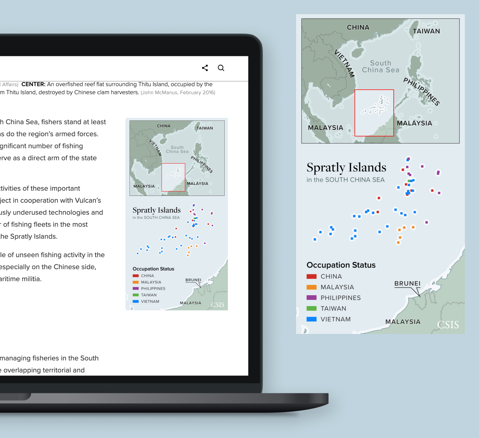
Gregory Poling undertook a six-month-long project in cooperation with Vulcan’s Skylight Maritime Initiative to gather and analyze data about the size and behavior of fishing fleets in the most hotly-contested part of the South China Sea, the Spratly Islands.
Not only was I excited about this collection of satellite imagery and data, but it was one of the first times that I truly curated narrative content instead of simply making a website to house future work.
My developer colleague and I saw the author's drafts evolve, making notes of potential visuals or inquiring after data sets or photos.
Once the author had decided which data maps and photos would be the most compelling alongside the written content, I personally collaborated with Vulcan to help coordinate the handoff of those deliverables.
Designing for the content
The author relied on data and photos for his analysis, so we already had quite a few visual elements to work with. Most of my design time would be used:
Creating or finding visuals that put the story in context
Styling maps and data to be more intuitive and branded
Providing Context
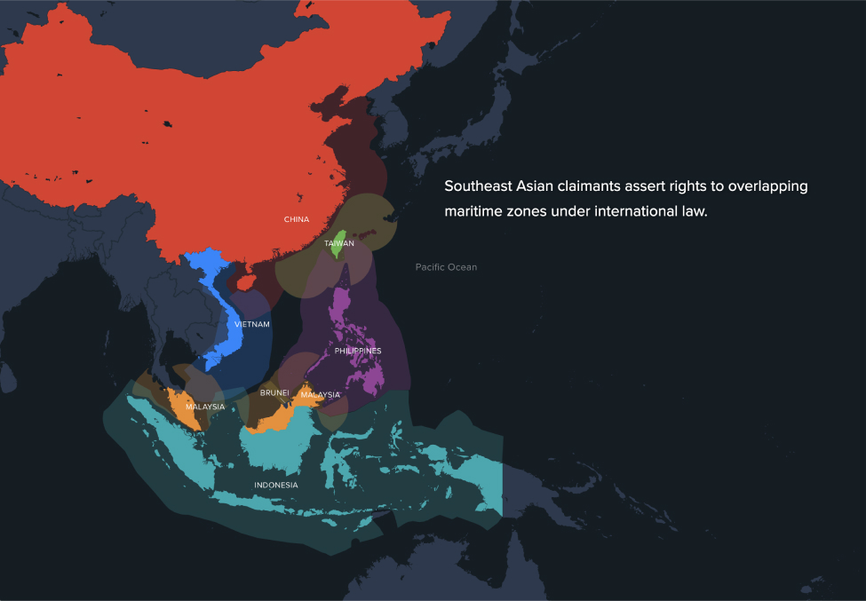
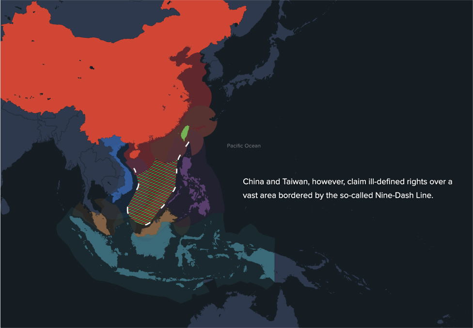
Particularly with this topic, I knew that we really needed to provide the reader with as much context as possible up-front. Disputes over territory in the South China Sea is an ongoing, messy business. Although some Americans may have heard of "island building", not many Americans understand the geography of the area or why particular locations incite more international scrutiny than others. In order for the reader to appreciate the gravity of the data and photos we provided, we needed to lay down some foundational knowledge.
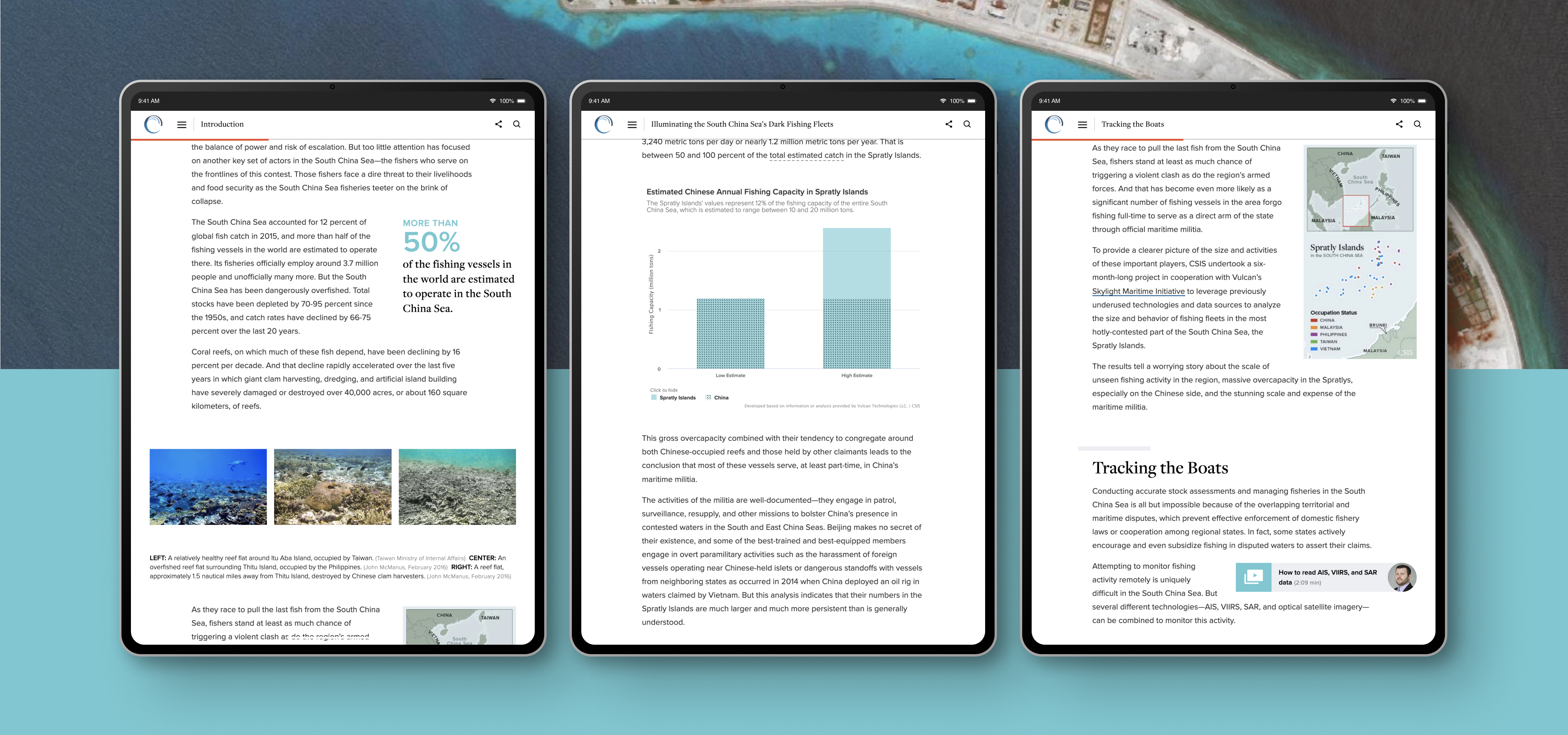
Map styles
Discussions about how we would display the data map visuals started early in the content development process. Some charts, for example, could stand as static images, but others needed to be displayed in a series that accentuated change over time.
After studying the layout of the article and the placement of the various maps, I knew I needed to apply a consistent base map style and data color palettes throughout the article. Switching back and forth could potentially disorient or mislead the user, particularly if they were new to the geography of this area.
I considered the technologies used to collect the data and how we could acquaint the reader with that tech through design.
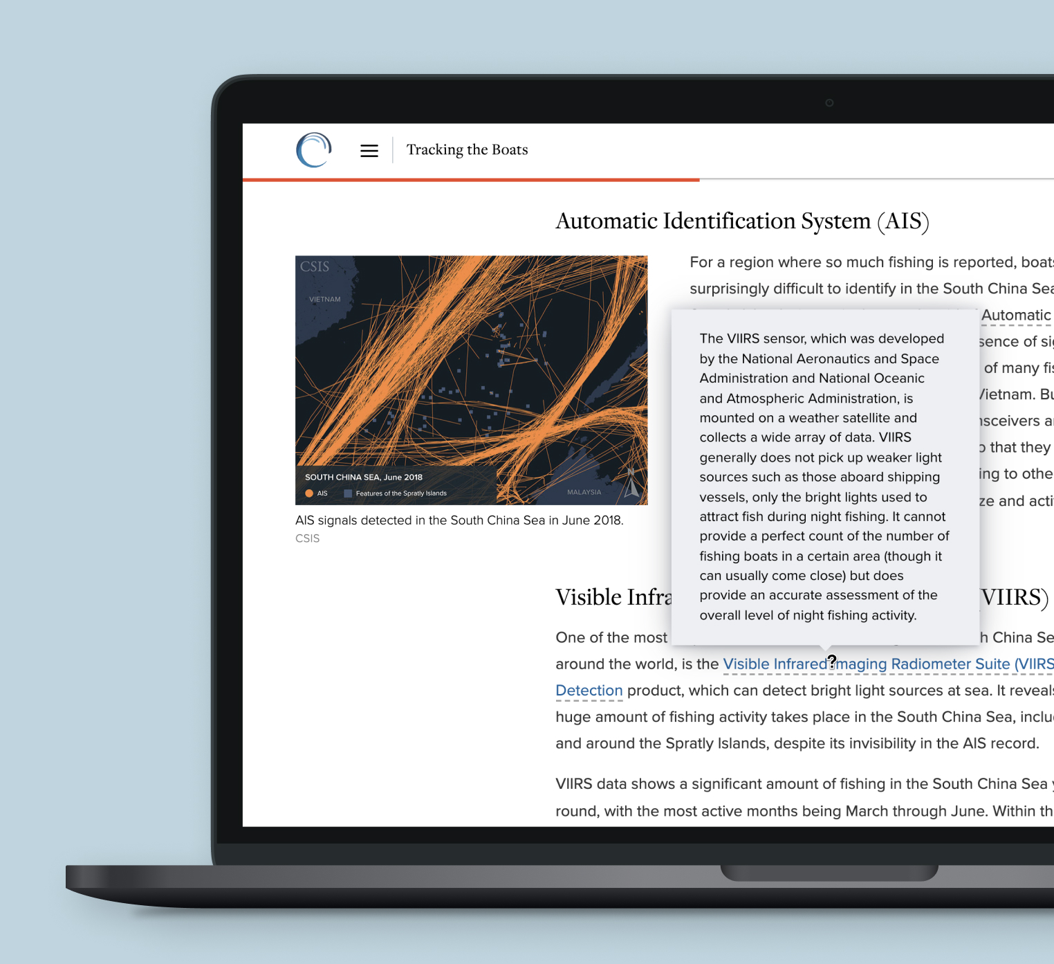
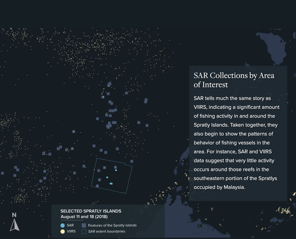
The VIIRS data was the obvious starting point for me. A Visible Infrared Imaging Radiometer Suite (VIIRS) sensor reveals bright light sources at sea. I wanted the colors of those maps to communicate the nature of that technology, so the base map was dark and the data was a light yellow.


Reflections
This Spotlight was one of my first real chances to collaborate on a long-form article at CSIS, and the learning opportunities did not disappoint.
One of my favorite aspects of being a designer is that I get to deep-dive into topics I work on. More so than when I design websites (although I do make a point to learn quite a bit about those topics, too). These long-forms offered me a chance to work by directing the content in a specific narrative, to pull it apart and examine the pieces. I do my own research and learn everything I can to fully understand what I'm making and why.
And I had a chance to practice information design. I did the research and developed functional and visual strategies to support a reader's processing and comprehension during a long scroll. I found the areas where miscommunication threatened to derail the author's message and forged a stronger line of communication.
This piece inspired me to seek out more long-form opportunities at CSIS and introduced me to the kind of content collaboration processes I've worked to develop since its launch.