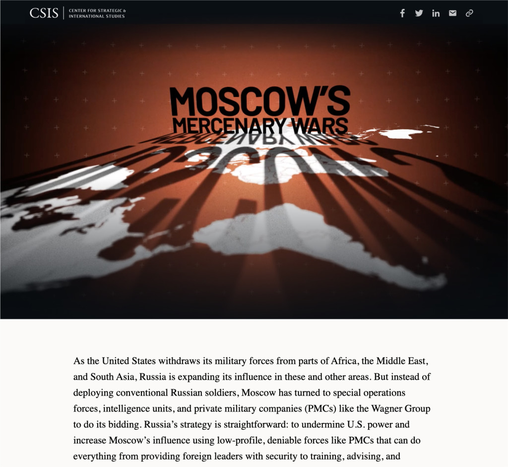
Moscow’s Mercenary Wars
This long-form explores the growing presence of Russian Private Military Companies (PMCs) around the world and their role as Russia expands its geopolitical, military, and economic interests.
About
"Moscow’s Mercenary Wars" is a long-form webpage that covers the expansion of Russian Private Military Companies (PMCs). In partnership with the Transnational Threats (TNT) Project at CSIS, I worked with my iDeas Lab colleagues to build an interactive narrative exploring how the PMCs are being mobilized to undermine U.S. power and increase Moscow's influence.
More so than many of the products I developed with programs at CSIS, the iDeas Lab team worked closely with the research team from the project's conception, giving feedback on the narrative as it progressed as well as guiding the creative process.
Making sense of the content
This was the first time our team (led by the lead developer and myself) collaborated with a program for a story like this. The subject experts from the TNT Project had settled on a topic, but how would our team guide the direction and development of the story before the content was written?
Intro to the topic and scope: We held several meetings with the research team to discuss Russian PMCs, the importance of this topic, and the audiences they wanted to reach.
Outlines: We asked the TNT team to give us a more structured view of the narrative by developing an outline. After several iterations and individual background research, our team had a better understanding of the content and a lot of ideas for visuals.
Rough Drafts: During the rough draft stage, we really started to narrow in on which visuals we would actually use and discussed where our primary audiences would benefit from more (or less) context.
Low-fi mockup: I created a low-fidelity mockup to review with both teams. I wanted to make sure that everyone could see how the written content and visuals would flow together.
Design hurdles
Once the TNT team had a nearly finalized draft, I began the design research phase in earnest to determine the overall style and base functionalities.
After settling on typography and colors inspired by Cold War posters, I took a closer look at the available (or potentially available) visual assets and let them inform many of the design decisions.
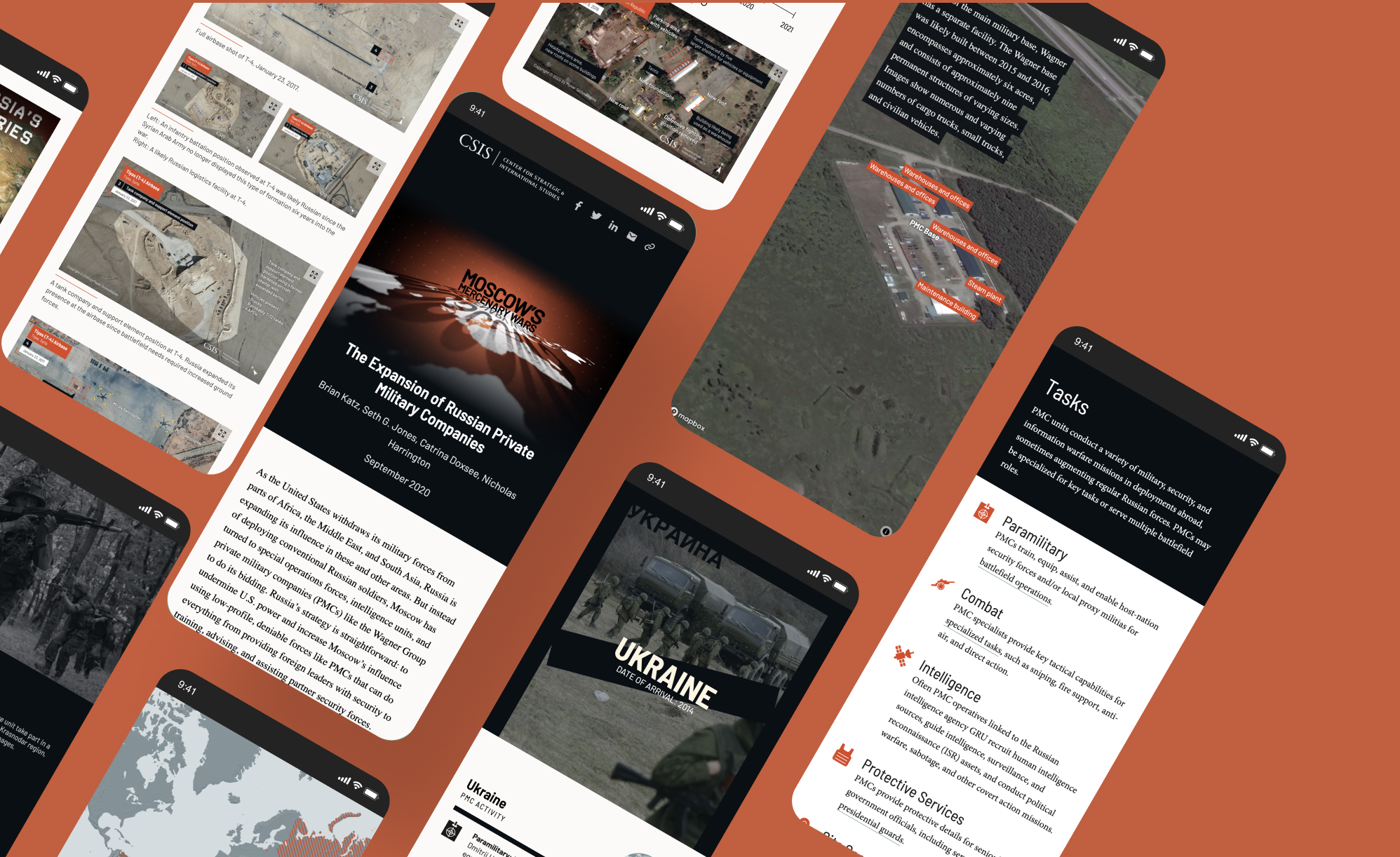
Photos from the ground
Due to the secretive nature of PMCs, there were very few creditable, quality, non-satellite photos available. We had to do some real digging to find the ones we ended up using. Honestly, I'm probably on a government list somewhere due to all the Russian websites I surfed in search of military photos.
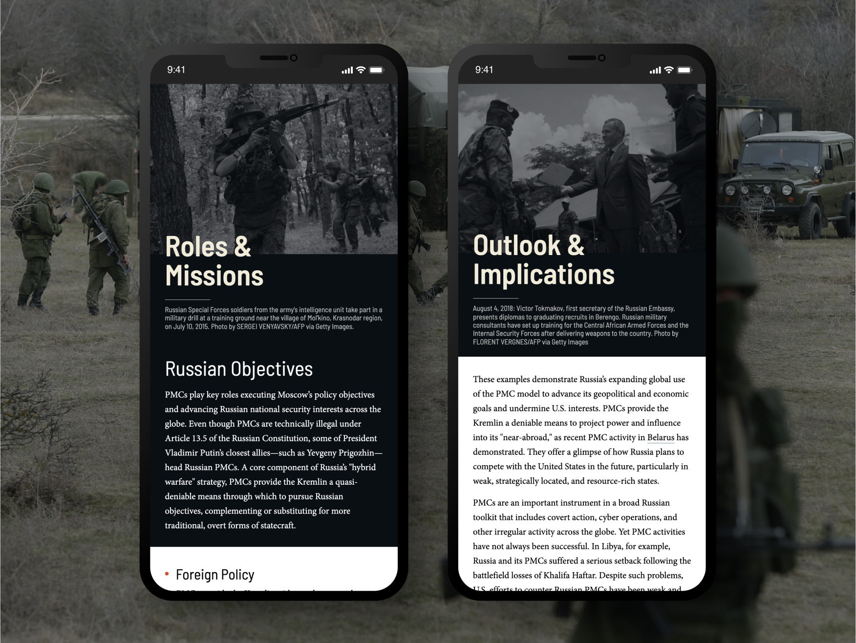
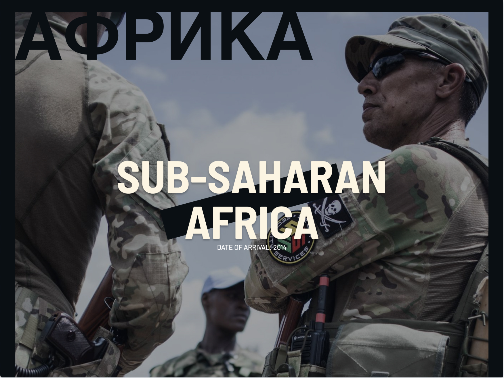
For the most part, I put those hard-won photos in the section headers. In particular, I wanted each case study to begin with photographic evidence of PMC presence in the area.
Embracing lists
Unlike photos, we were not lacking in lists. Lists are great for readability and scanning, but I didn't want to just have a bulleted <ul> after <ul>. I also noticed that the lists tended to take up a significant portion of the section's overall written content, with individual items varying in length from a sentence to a paragraph.
The benefits of chunking text with lists are reduced greatly if each item drags on for several lines. To help make those long lists more effective, each item began with a simpler, emphasized word or phrase in the style of a description or labeled list.
A new kind of collaboration
This was one of the biggest collaborations between the iDeas Lab subteams on a web project to date, and I was excited to help coordinate and lead the development of this product’s visual elements.
It was challenging to develop high-fidelity mockups without certain components, and to have an idea of what I wanted without doing too much of the work myself. I found that some blocks of content were more self-contained and less reliant on the style and layout of their surroundings. Those would be easy to integrate back into the narrative and so were best suited to hand off to other designers.
Once I had a good idea of the long-form's layout and had styled a few sections of content, it was time to delegate work to others on the team. I introduced my colleagues to the topic, the styles I had developed, and the direction I was hoping to take with the pieces they would be responsible for.

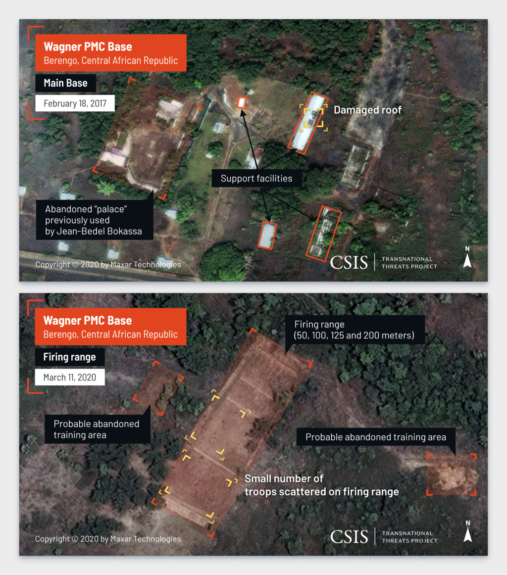
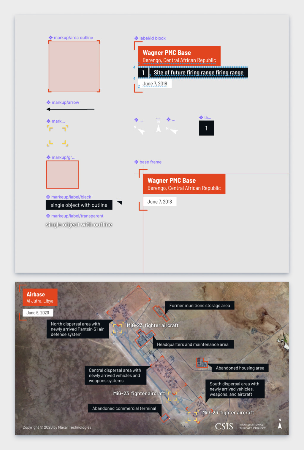
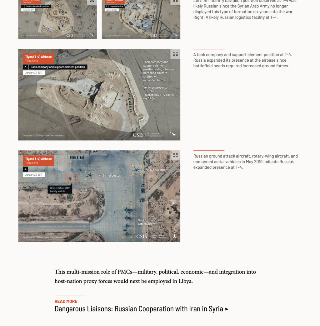
Styling satellite imagery
CSIS started to work with a satellite imagery analyst a few years ago and has used many of those annotated photos in publications and on websites since that time.
I never really had the opportunity to work with an analyst before, and I was definitely looking forward to learning about that kind of markup. Once a style had been established, I scheduled a meeting with the analyst so he could answer any lingering questions and confirm that our markup was specific and accurate (whew! I'm glad I asked).
Reflections
Overall, this project was a lesson in collaboration, particularly collaboration in a time crunch.
I started to figure out how to collaborate at this scale with the CSIS scholars. It was a challenge to develop a visually engaging piece with partners who don't have the same workflow or way of thinking. In the future, I plan to implement storyboarding practices. I think it will help our partners approach the product as an experience rather than a linear narrative.
I also started to work with new tools and develop better practices to collaborate remotely with other creative colleagues. It really helped that I started documenting resources, design decisions, and visual inspiration for components early on. When we started splitting up responsibilities, I could begin by sending a link to the appropriate documentation. As decisions and resources evolved, we all tried to rely on those notes as a single source of truth.
And it was quite a success for the TNT Project, with over twelve thousand page views after ten days.